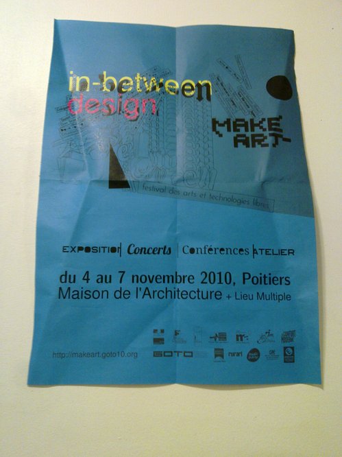
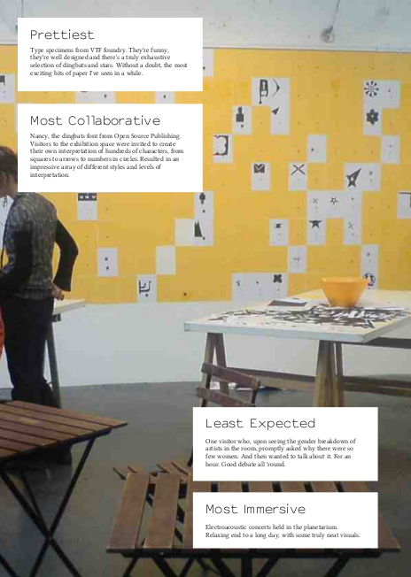
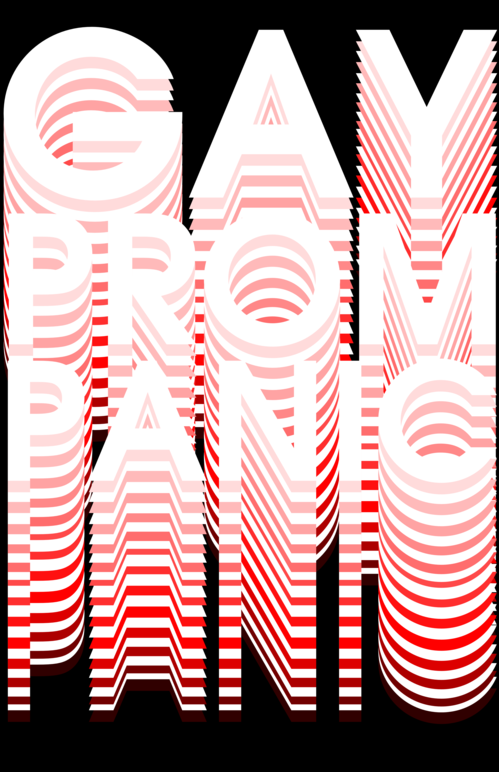
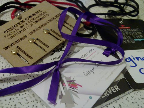
Conference ephemera is kind of fun. Different organizers, different attitudes result in different things. And if I don't collect conference ephemera, how will I remember that I was there? So here's where I've been in the last month. The tail end of Free Culture Forum and the first day of Drumbeat, on my way to Poitiers. No lanyard from Make Art, but there is a very fine (although slightly crumpled) poster. The awesome laser cut tag id from DIY Citizenship and finally, a nice purple ribbon from HTMlles. Bit of a busy month, but with some darn nice bits and pieces to commemorate it.
November 2010 Archives
I'm going to be self-indulgent for a moment. Today, I do not have any exciting ideas or projects to share, any neat graphical thingies. Today, I am going to tell you very briefly about the last two weeks and why I've just spent the last three days sleeping.
A little over two weeks ago, I was in France. In Poitiers, to be precise, attending the most excellent 2010 edition of Make Art. And it was absolutely excellent. I spoke about Libre Graphics Magazine. You can, in fact, see that talk here. Despite being the last talk of the day, there was a pretty astounding amount of energy in the audience. And people were delightfully receptive. So, good. That, for your time keeping records, was the 6th of November.
I spent the 7th and 8th of the month frantically working on the above mentioned Libre Graphics Magazine. Originally slated to be released on the 8th, we decided, for the sake of quality to push the release date back by a couple days. That Wednesday, the 10th, I spent the day in a recording studio, first recording then watching the mixing of the narration for my new (and still not really done) project, When We Were Bigger Than We Are Now, which is a co-production of the National Film Board of Canada and Studio XX. And that's what the remainder of the week was made up of: Libre Graphics Magazine and When We Were Bigger Than We Are Now.
By the 16th, Libre Graphics Magazine 1.1 was out and ready to go, with the PDF off to the print shop, too. I spent a large chunk of the 17th working on publicity for that, which had some pretty good yields. We got mentioned on LWN.net, which was a truly great thing.
On the 18th, When We Were Bigger Than We Are Now launched at the HTMlles festival. Awesome.
The 19th and 20th, I slept, because a nasty cold decided it was time to catch me up. Today, though, I'm back at it, getting ready to talk about When We Were Bigger Than We Are Now again, tomorrow. So I'm making slides. Which I'll post later. They'll be pretty.
And that, my dear blog, is why I've been so absent.
I'll admit that I am generally bothered by dodgy work-from-home and beauty tip ads on the internet, or elsewhere. However, the three below are exciting examples of their type.
Three things about these ads:
1. Nice use of my IP address to target me, personally. Why yes, I am Canadian. That could be me!
2. Not quite nice enough use of my IP address to target me, personally. As of right now, I'm in Quebec, with a clearly Montreal-based IP address. Ad number three makes reference specifically to a "Toronto Mom's" exciting dermatological breakthroughs. That localization just plain isn't good enough. One tenth of Canadians, roughly, live in Toronto. The other nine tenths tend to not be fans of that Torontonian tenth. We have a pretty serious urban-rural divide, as well as a hefty East-West divide in this country. Or, in my particular case, the Ontario-Quebec divide. In Montreal, there's a two in three chance that my first language will be French, a very good chance that I'll support the Habs and a pretty reasonable chance that I might just refer to the rest of the country as "Canada," as if I wasn't exactly a part of it. Never mind, for a moment, that I'm an Anglophone, Senators-supporting Ontario kid. Breaking out a "Toronto Mom" to a Montrealer as a selling point is probably not the best idea.
3. But this bit is most important. Ads one and three give a clear indication of some shady cabal of medical practitioners which DOES NOT want us to know how to make ourselves look prettier, younger, whatever, with cheap tricks from the internet. I really love the idea of a group of dermatologists or dentists, at a meeting, plotting about raising the prices of teeth whitening or skin treatments and loudly bemoaning the fact that their secrets are getting out. I wish that existed. They could be like incredibly prosaic Bond villains.
And it's amazing. A more accurate title for this post would be something like "Libre Graphics Magazine issue 1.1 now available," but that lacks an element of fun.
If you haven't been looking for the last three months, you may not have noticed that something really neat was happening. That something really neat is called Libre Graphics Magazine (although the official title, for the benefit of those wishing to look it up in WorldCat or something, is just Libre Graphics, or by numbers, ISSN 1925-1416 Libre Graphics (Print) and ISSN 1925-1424 Libre Graphics (Online), something I'm still very excited about.) and it is, as the title might suggest, a magazine devoted to Free/Libre Open Source Software art, design and graphics.
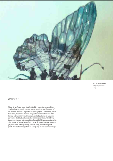
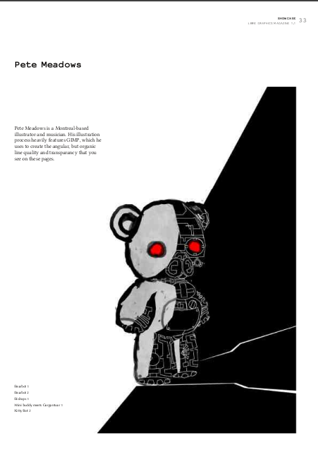
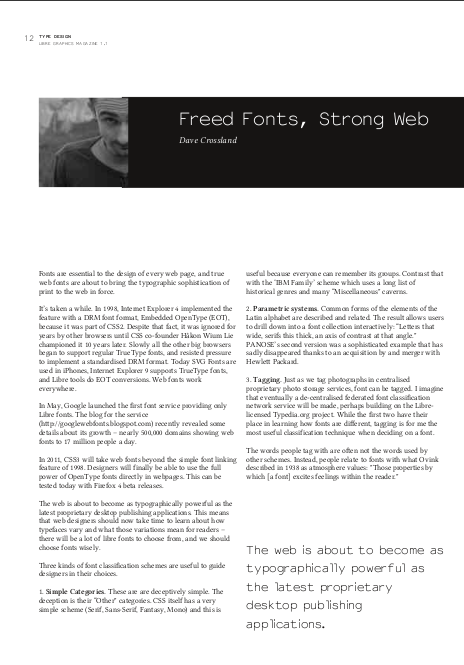
So we've finished it. That we is Ana Carvalho, Ricardo Lafuente and myself. And frankly, we're pretty damn proud of what we've managed to do. So I invite you to take a look at it. It's available in PDF in two different levels of quality, as well as for sale at the minimal price of $12(CAD) for this issue, $45 (CAD) for an annual subscription (that's four issues) or $100 (CAD) for a supporter subscription. You can find the downloads and the purchasing options at libregraphicsmag.com.
Below, some pictures of my favourite bits.
Ana Carvalho and Ricardo Lafuente, my fine colleagues and co-editors of Libre Graphics Magazine have been working on a most excellent font. It's called PropCourier Sans and goes by the tagline "We are not here to be correct." It is also, in fact, the display and identity font for Libre Graphics Magazine. Because I like it so much, and because I've been looking at type specimens of other F/LOSS fonts, I thought I'd do one for PropCourier Sans. Ta dah.
There's a story up on Boing Boing right now called "Gay prom panic strikes Australia." I thought the phrase "Gay prom panic" deserved an exciting poster. See below. (Click the image to get a printable size, 11x17" 300dpi). I also think this would be an excellent name for a band, if it isn't already.