Making the TTC map classy
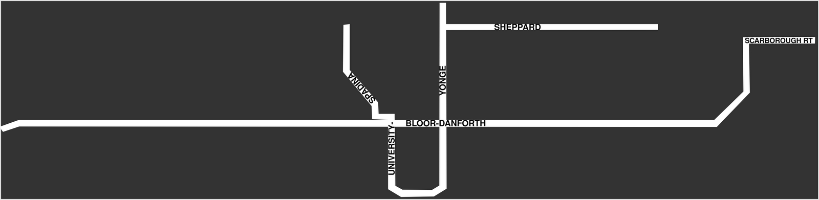
I love a good subway map. And I find it interesting how different subway maps are from street maps. Below, an experiment in doing a subway map (the Toronto Transit Commission map, to be precise) in my own particular street map style.

Labels: design, organization, toronto, transit, urbanism
posted by ginger coons at
1:13 PM
![]()
0 Comments:
Post a Comment
Links to this post:
Create a Link
<< Home