Monday, February 8, 2010

Making the TTC map classy

I love a good subway map. And I find it interesting how different subway maps are from street maps. Below, an experiment in doing a subway map (the Toronto Transit Commission map, to be precise) in my own particular street map style.

Labels: , , , ,

Sunday, January 31, 2010

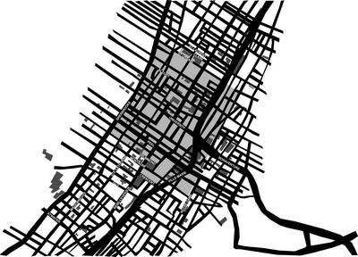
Another map of downtown Montreal

Below: I've done yet another map of downtown Montreal. This one details parking lots (dark grey) and the newly defined high parking lot taxation zone (light grey). Visible trend: parking lots in areas with higher property values are discouraged through the use of higher taxes. This goes hand in hand with the current master plan, which aims to densify the central business district.

Labels: , , , , ,

Sunday, November 8, 2009

Panopticoncordia

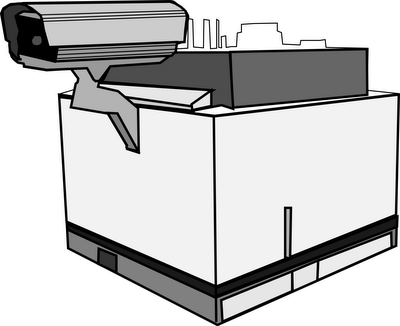
Because I've yet to kick the habit of drawing Concordia buildings, here's another: the Hall building as panopticon (okay, so it isn't actually a real panopticon, given that it's only looking in one direction, but I couldn't resist calling it Panopticoncordia).

Labels: , , , , ,

Sunday, November 1, 2009

Menacing PSA Posters

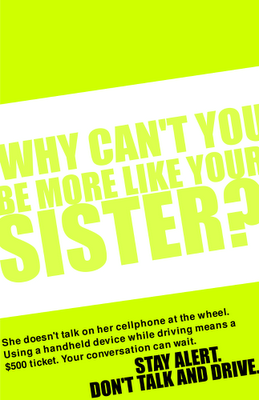
Ontario has some new legislation meant to penalize people who talk on handsets while driving. The two groups most likely to talk and drive are young people and taxi drivers. So, in the fine tradition of alarming and mean public service announcements meant to scare people into compliance, I've made a couple posters.

Labels: , , , , , , , , ,

Saturday, August 22, 2009

Isometric Concordia

The farther I get from Concordia, the more I seem to wind up doing representations of it. Below, the major buildings in the Quartier Concordia, towering above a flat downtown.

Labels: , , , ,

Wednesday, July 15, 2009

Quartier Concordia map

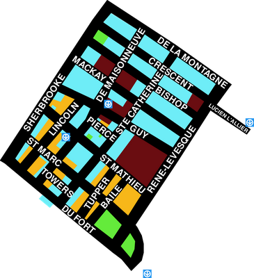
I'm working on a map detailing the amenities around Concordia's downtown campus. Here's a version with the whole neighbourhood broken into usage. Burgundy is a Concordia building, turquoise is commercial, orange is residential and green is some sort of civic use or museum. The blue boxes with arrows represent the entrances to metro stations.

Labels: , , ,

Wednesday, June 3, 2009

A troubled bridge over water

Here's a problem for which I don't yet have a solution. There's a wonderful canal in Montreal called the Lachine. About 20 years ago, Parks Canada took over its management, cleaned it up, built footbridges over it and built a park and bike path next to it. It has one particularly problematic footbridge. It's at the end of Atwater Ave., near Atwater Market. It's a very narrow bridge with little signs on each end telling cyclists to dismount before crossing. Of course, given its proximity to the market and several other attractions, it gets a lot of traffic. The traffic is mixed. There are pedestrians of all ages, cyclists and even tourists on the little electric scooters that can be rented at some of the shops along the canal.

What's the problem? The bridge is wide enough to accomodate two directions of pedestrian traffic. Even so, it gets cramped. The majority of cyclists, who are progressing at speed along the bike path, apparently want to get across the bridge and onto the next path as quickly as possible. All of this means that very few cyclists obey the sign and dismount. The cyclists speeding across the bridge pose a threat to pedestrians. Even worse, the renters of electric scooters don't dismount either. Their vehicles are heavier, faster and take up more space than those of the cyclists. So, because very few people obey the sign, the bridge becomes congested and dangerous.

I've thought up a few solutions to this, but none of them are sustainable. There's the citizen action approach. I could start personally mentioning to cyclists, whenever I happen to be crossing the bridge, that there is a sign telling them to dismount. But that doesn't work because I don't cross that bridge nearly enough to make a tangible difference. Then, there are institutional approaches. They could get bigger signs, although I really don't think that would work. They could install speed bumps, but that might not properly discourage all cyclists, might cause injury to some, and would inconvenience everyone.

Basically, I'm stumped. I can isolate the problem and even explain why it is actually a problem (and not just me being grumpy) but I can't figure out a good, sensible solution.

Labels: , , , , , , , ,

Wednesday, May 27, 2009

If life gives you invasive technology, make yourself difficult

Without a metro pass, I'd have serious trouble getting around. At the same time, I value my privacy. Starting June 1st, the Societe de Transport de Montreal is going to make me choose. That's the day the entire system rolls over to the OPUS card, an RFID based smart card. For months, I've been trying to figure out how I'm going to get where I need to go while protecting my own privacy. I think I've finally got the answer.

If I were to buy an OPUS card using my credit or debit card, it's very likely that the STM would link that information to my ride history. If I were to insure my card against theft or loss, the STM would then be able to associate my name and other personal information with my ride history. Simple solution to the problem of having my identity associated with my ride history: pay with cash and don't take the STM up on their replacement guarantee.

There's another problem, though. Even if they don't know my name, I'm still carrying around a remotely readable card that links me to my ride history and gives information on where I go at what times. Being the obstinant type, I'm willing to go to some lengths to make sure that my OPUS card doesn't actually paint a clear picture of what I do. So, what's the best way to obfuscate ride history? I've decided to take steps to make my ride history as outlandish as possible. Over the next few months, I plan to go to as many different metro stations as possible, frequently. I plan to rack up as many trips to as many odd places as I reasonably can. Not only will it let me see bits of the city I don't normally get to but also, if they do wind up checking out my ride history, it'll give them something interesting to read.

Labels: , , , , , , ,

Wednesday, May 13, 2009

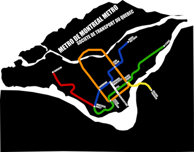
Montreal Metro Map Circa 2032

One of my ongoing projects: imagining what Montreal's Metro system will look like in the future. Here's my fictitious 2032 Metro map, as released by the equally fictitious Societe de Transport du Quebec. (If you care to look at more fictitious future history, I collaborated on an article a couple months back about Montreal 2032, which you can read here.)

Labels: , , , , , , , , ,

Friday, April 10, 2009

Bring back phone booths

I don't want to look like a fiend for nostalgia, but I think we need to reintroduce phone booths to the urban landscape. Why? I'm sick and tired of having private conversations in public. Cell phone saturation is high. More and more phone conversations (and important ones, at that) happen outside the home. There are very few quiet places to go when taking a phone call. I'd like to see phone booths, without phones, back on every street corner. It might just lower the incidence of people yelling in the street.

Labels: , , , , , ,

Sunday, December 14, 2008

Cut Here

More illustration backlog. This one was for an article about a proposed underpass that would effectively cut a neighbourhood off from the river.

Labels: , , ,

Saturday, November 15, 2008

Tetrisland

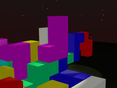
I'm currently working on turning old video games into 3D environments. Eventually, once I figure out the game engine in Blender, the environments are going to be populated in a rather interesting way. Details on that later. For now, I present to you Tetrisland: Dark, forbidding, the cheery blocks denying the seedy underside of this impersonal, cookie cutter, sky scraper town. Ominous enough?

Labels: , , , ,

Wednesday, November 5, 2008

Subway Ceilings

I avoid looking people in the eye on the subway. In turn, they avoid looking me in the eye. When the subway is packed, there's nowhere to look but at the floor or ceiling. The problem is that I can only stare at the ceiling for so long before I get bored. I never think to bring a book and don't really like the tabloid newspapers they hand out at rush hour.

Solution: Commission art for subway car ceilings. Give commuters something interesting to stare at. Print a magic eye or Where's Waldo sort of graphic up there. Art, puzzles, poetry, whatever. Just no ads. I don't think that subway riders should be abused that way.

Labels: , , , , , , , , , , ,

Wednesday, October 22, 2008

Landscaped metro stations

I've been researching house plants and humidity. It would seem that one needs the other, but also that the first does a rather nice job of regulating the second. This has gotten me thinking. Plants like humidity. Some metro stations in Montreal are so humid that they literally have stalactites extending from their ceilings. What's the clever, humidity regulating, life enriching solution to this problem? Obviously, the STM needs to turn metro stations into giant, beautiful terrariums. Plants would make the metro stations more comfortable for passengers. And they'd be significantly less drippy, too. The only major retrofit involved would be switching the florescent lights for something a little more grow light-y. Landscaped metro stations? Oh yes.

Labels: , , , , , , , ,

Monday, June 9, 2008

Cyclist pants

Fact: most cyclists cinch or roll one leg of their pants so that it won't get caught in the bike chain.
Logical conclusion: Make a pair of pants with one leg shorter than the other.

Labels: , , , , , , , ,

Wednesday, May 28, 2008

How to be lazy in the city

I've realized that when I live in big cities, there are far more ways to be lazy than when I live in small ones. Without further ado, method number one for being lazy in a big city.

Don't dry your hair. If you take the subway to work or school, you'll never need to blowdry your hair again. Towel it dry a little, so that you don't drip on others, but there's no need to finish the job. Instead, just stand under the vent in the subway car. There's that spot near the doors, where the ceiling has a great big round vent. On dry hair, it has the effect of mussing. On wet hair, however, it's super handy. If your subway trip is any distance, you'll get your hair blowdried, without running up your own electricity bill or wasting time. Huzzah!

Labels: , , , , ,

Wednesday, May 7, 2008

Late night grocery stores

There's a late night grocery store on my way home. I hardly ever use it, but I appreciate that it exists. In that sense, for me at least, it's similar to a falafel restaurant. Tonight, however, I got the chance to use it. Wandering home from a late movie, I got a jones for orange juice. But where can I possibly get orange juice at one o'clock in the morning? Quite simply, I can get the orange juice about one block away from home, on my path from movie to bed.

Most of the time, the late night grocery store is a service I don't feel the need to use. Even though I seldom use it, it's something I like to have around, just in case I find myself needing it.

Labels: , , , , , ,

Wednesday, April 23, 2008

Painters in the park, but never graphic designers

It seems that people like watching painters paint in parks. It stands to reason, since people often hold such events, that painters don't much mind painting in parks. They may even like it. Okay, so painters like painting in parks and people like watching them. This leads to all sorts of painting-in-parks events. Why not graphic-design-in-parks events, then? They're both visual things. They both turn out very visual, mostly flat things.

Today, I found out why there are no graphic-design-in-parks events. I took my laptop for a trip to the park today. The weather was nice and I wanted to sit under a tree. Big mistake. I now know why computer geeks like living in dark dungeons. The noonday sun turned my screen into a mirror. While it's great to see that I don't have any food stuck in my teeth, a reflective screen isn't exactly fantastic for doing picky work with colours and curves. I don't think we'll be seeing groups of designers mocking up newsletters or logos in parks any time soon.

Labels: , , , , , ,

Thursday, April 3, 2008

Urban mini-forests

A fun strategy for getting more green space and biodiversity in cities: In cities with wide sidewalks, tear out a strip a couple feet wide, next to the road. Lay in a good supply of soil and other necessaries, and then plant a micro-forest. Instead of those wussy single trees in grating, you'd wind up with a nice sound break between people and cars, as well as a habitat for urban wildlife and a good drainage system. It's a win for everyone.

Labels: , , ,

Saturday, March 1, 2008

Projections on buildings

I'm working on a group project at the moment that involves creating a proposal for an urban practice. Our idea is to project site specific movies onto historic buildings around Montreal.

I walked past the Canadian Centre for Architecture this evening and noticed something that a) made my jaw drop, b) confirmed my high opinion of the ideas of design students. This evening, presumably for Nuit Blanche, they're projecting on the wall of the CCA. It's lovely. Windmills, oil rigs, all sorts of stuff relating to their current exhibits. Admittedly, their walls make a better blank canvas than most of the older buildings in the city, but it still makes me feel all warm and fuzzy inside to know that it's being done.

Labels: , , ,

Sunday, February 24, 2008

Mixed feelings about falafel

Ever since I first set foot in Montreal, even before I moved here, I've had a love-hate relationship with falafel places. I don't really like falafel pita that much, and whenever I get a plate instead of a pita, there are always a load of things that I just don't want to eat. (Actually, I think that might be a corollary of Murphy's Law: No matter what you order on the falafel plate, there's always something unappetizing.) Even though I don't actually like falafel that much, and even though I never feel good after eating it, I have a strange sense of security knowing that I can always get one if I want to. I think that's a little odd. I have some kind of strange dependency on falafel places, even if I hardly ever patronize them. Maybe it's like having a fire station nearby. Even if I don't plan on setting fire to my house, I feel more comfortable knowing that there are pumper trucks and fire fighters a few blocks away. Falafel as emergency service?

Labels: , , , ,

Thursday, February 21, 2008

A theory about cul-de-sacs

I know this new theory isn't even remotely true, but I'd like to posit that cul-de-sacs exist for the benefit of people in aeroplanes.

Cul-de-sacs look fantastic from the air. They add lovely twists and turns to a city. They are, however, significantly less good for people on the ground. They take up loads of space, they're quite confusing, and they cause getting places to be more time consuming.

This leads me to believe that cul-de-sacs exist to be looked at from the God's eye view, which is to say, the aerial view. Pre machine assisted flight, the only people/things/animals/fictional characters who got to look at things from above were birds and God(s). These days, sixty dollars gets you from point A to point B in an hour, with the added advantage of a killer aerial view for the duration. The result is that everyone can have the view from on high.

We're all gods now.

Labels: , ,

Monday, February 18, 2008

The garden as a metaphor for the city

Flying into Toronto the other day, I got a chance to look down at the buildings surrounding the airport. It struck me how many houses there were, and how few taller buildings. I then started thinking that cities could be viewed like gardens. Houses and other low-lying structures are ground cover. Basic tract houses remind me of grass. They look very homogeneous from the air. Taller buildings are plants. They stand out above the ground cover, but with the way architecture has been unremarkable in the past century, very few of these plants can be called flowers. We seem, also, to be missing shrubs. I don't think we have the buildings yet that could be likened to shrubs.

So, how can we make our cities into better gardens? More flowers. That means more variety, more colour, and taking more chances with architecture. Some different varieties of ground cover might be nice, too. And shrubs: I'd like to figure out what architectural shrubs could be.

Labels: , , , ,

Tuesday, February 12, 2008

Rooftop patios

Downtown Montreal is full of buildings with flat roofs. Not only are the roofs flat, but they're built strong enough to stand up under snow. Despite the wealth of strong, flat roofs, there's a serious shortage of rooftop patios. I find that there's something wrong with that situation. To me, it seems simple that strong, flat roofs should mean lots of wonderful rooftop patios. No one would even need to do very much. They'd just have to put up some barriers to minimize their liability. I think that the denizens of the office buildings would seriously benefit from a little fresh air and a fantastic view.

Labels: , , , ,

Sunday, February 10, 2008

Results of the trip to Parc Ex


I humbly present one of the adorable photo illustrations that resulted from my trip to Parc Extension last weekend. I'm viewing it as what we might see if mother nature were more literal minded.

Labels: , , , ,

Sunday, February 3, 2008

Carpet Beaters

I went trekking through Parc Extension today. The very best thing I saw: a woman outside of her apartment, in the dead of winter, beating an area rug. I didn't really realize that there still exist people who take their rugs outside and beat them. I mean, it's something I never really think about. To the extent that I ever do think about it, it feels like a kind of anachronism. It seems quaint. It shouldn't, of course. After all, beating the dust out of a carpet takes no electricity. That makes it less energy intensive than using a vacuum cleaner. Very eco, right? Also, it's way more frugal. If you only have sweepable floors and area rugs, there's no need to own a vacuum. Sounds sensible. Having said all of that, even though it clearly makes sense to take carpets outside and beat them, I was surprised to see someone actually doing so. It was a profoundly nice surprise.

Labels: , ,

Tuesday, January 29, 2008

why the shoe repair shop makes me happy (or: what's not to like about mixed use neighbourhoods?)

Often, when I walk past the shoe repair shop, it strikes me just how fantastic my neighbourhood is. Really, it's the prototypical mixed use neighbourhood. Within a three block radius of home, I have access to a grocery store, two hair dressers, a video store, several pubs, at least six different restaurants, a newsagent, a museum, two parks a metro station, the highway, if I happened to want it, and of course, the previously mentioned shoe repair shop. All of that, on top of the whole pile of mixed residential, as well as the office buildings two streets over.

I don't ever need to leave the bubble. And that's what makes me wonder. I have trouble grasping why anyone would want to live in an area that didn't have everything within reach. Is it actually pleasant to have to leave the neighbourhood to get groceries? Is there some factor in non-mixed neighbourhoods that makes it worth the inconvenience? I find it very hard to believe that anyone would be willing to trade the corner store for a detached house and a yard.

My neighbourhood forces me to exercise, because most things that I need or want are within walking distance. Because I can walk, I don't need to spend money on maintaining and fuelling a car. The sheer proximity of amenities gives me the opportunity to be healthier and have more disposable income. What's not to like about that situation?

Labels: ,