Wednesday, February 3, 2010

NATO Phonetic Alphabet Book: S-T

Continuing on with the NATO Phonetic Alphabet Book (see previous post), I present to you the letters S and T.

Labels: , , , , , , ,

Saturday, January 23, 2010

NATO phonetic alphabet book

I like alphabet books. I like A is for Apple, the making concrete of letters that is accomplished by associating them with things. And of course, I like standards. This is why I'm working up a set of illustrations for an alphabet book based on the NATO phonetic alphabet (you know, alfa, bravo, charlie and so on). Below, some of the first illustrations.

Labels: , , , , , , ,

Tuesday, January 19, 2010

Colour for everything, especially wool

The post below is cross-posted on my Open Colour Standard process blog, but I thought it would be worth a look here, too.

There absolutely needs to be an open standard for print colour. I'm behind that and I'm working on it. But I'm increasingly of the opinion that there's more to it than print and screen. There's a world of physical things that depend on some sort of colour specification, whether loosely defined and changeable or rigid and consistent. On that first count, the loose and changeable, I've gotten to thinking about yarn and other animal proteins like silk and even human hair.

Anyone who knits knows well the pain of not buying quite enough yarn to finish a project, going back to the store, and finding that the yarn you've been working with, while still called by the same name, is a slightly different colour than before. Eventually, you learn to buy more yarn than you think you'll need, just for the sake of consistency. That's the problem with dye lots. Every batch of yarn, while using the same dye and same general process, comes out slightly different.

I'm not proposing to necessarily solve the dye lot problem. I have a hunch that a large part of it comes down to white and the inconsistency of the base colour of wool. But it has gotten me thinking. Wool is an interesting test case. It's easy enough to deal with, it has good possibilities for home brew colour experimentation and, most importantly, there's the dye. Wool, being an animal protein, can be coloured with acid dye. Or, to you and me, food colouring.

The food colouring angle is a good one. One of the biggest challenges of thinking about a spot colour system is sorting out the physical colour. It's been a hurdle in my exploration of colour for print. How, the thought goes, do you decide what the gamut of inks going into the spot colours will be? Are those colours consistent across ink manufacturers? And so on. This is the appeal of acid dye. In North America, at least, there's a handy gamut all ready to go. It's the set of dyes prefaced with the letters FD&C (food, drug and cosmetic) or D&C (drug and cosmetic). That's a limited gamut of dyes already carefully regulated by a government body. It takes away the gamut decision and just leaves questions of application and method guidelines/best practices, as well as the development of physical colours from those dyes and the translation of those colours into digital.

In short, expect some proof-of-concept wool and hair dye experiments from me in the near future.

Labels: , , , , , , , , ,

Monday, January 11, 2010

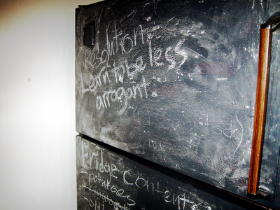
Chalkboard fridge

Fridges are great. They're great when covered in pages from old comic books, they're great bare and I'm increasingly of the opinion that they're great when they double as chalkboards. I say that, of course, because a few months back (call it October 2009 or so), I painted the fridge with chalkboard paint. It's handy for keeping a running list of groceries in stock, shopping lists, or in the case of the front of the freezer at the moment, my resolution for 2010.

Labels: , , , , , , ,

Sunday, January 10, 2010

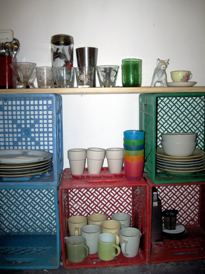
Low art china cabinet

My parents have a china cabinet, full up of all the ancestral stuff. In my life, a china cabinet would be inappropriate. Such a severe piece of furniture would put my plastic cups and mismatched mugs to shame. Below is my answer to display storage. It has the same function as a china cabinet, that of showing off my tableware, but lacks the gravitas of more traditional styles. Mine is made of milk crates and the slats from a broken IKEA bed. It's held together by nuts, bolts and some truly massive washers. I quite like it. It isn't, however, new, only newly documented. It was built in either late 2007 or early 2008. But I've been on a documentation spree lately, so here it is.

Labels: , , , , , ,

Saturday, January 9, 2010

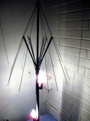
Umbrella Lamp

Close to a year ago, I made the umbrella lamp. I'm posting it now because I've finally gotten around to documenting. It's fairly simple. The umbrella lamp is an old IKEA lamp with some bits removed and an equally old umbrella that's undergone much the same treatment. The light bounces off the umbrella spines, creating a slightly sparkly effect. It also casts a pretty excellent shadow. In short, dismembered IKEA lamp + broken umbrella = umbrella lamp.

Labels: , , , ,

Truth in design, Truth in production

There's a design principle that I've often taken for granted. Distilled down to one word, it's Truth, with a capital T. But what is Truth in design? How does it apply? What, in short, does it mean?

There are two examples I like to use when explaining Truth in design. They both have to do with materiality. Here goes. Say you're designing a poster. You want it to look a little old school, a little messy, but still a little official. In short, you want your typography to have the look of an old-timey typewriter font. An easy reaction, when pressed for time, is to grab a typewriter font. I'm not talking about Courier, but instead about something that tries to mimic the little errors and ink blots of a worn out typewriter. But that font isn't very true. Use it and you'll find that all the letters look the same, each instance of a letter exactly like its siblings. It's not organic. It lacks soul. Not only that, but it's obvious that it wasn't done with a real typewriter. Then there's the truthful way. You dig out the old typewriter and honest to goodness type out the text you want. Scan it, clean it, integrate it into the poster. Each letter is a little different and the whole thing comes by its blotches honestly. In short, it's true. It's meant to look like the product of a typewriter and it does because it is.

Truth, however, is also utilitarian. That's where my other example, the one with the corkboard, comes in. Say, for the sake of argument, that you want the look of pictures or notices pinned to a corkboard. Sure, you can open up your graphics program and plunk a stock texture of cork in. You can drag whatever you want onto it, even simulate the shadows cast by the tacks. But why would you? In real life, light casts shadows for you. If you actually print the photos (or notices, or whatever) and pin them to a real cork board, it looks right, automatically. Why add shadows when light can do it for you? If you try to do it digitally, you'll miss something, or agonize for far too long in order to not miss anything. Do it in reality and the details are taken care of. Nature does half the work for you.

In essence, Truth is about materiality and reality. It's about doing it properly, with the right materials. In an idealistic sense, it's about knowing that you've got something right, that it is how it should be and isn't just an imitation. In a practical sense, it's about covering your bases, not by thinking out every eventuality, but by letting reality do the work. It may not always be convenient, but it will always be right.

Labels: , , , , , ,

Friday, December 4, 2009

Sitting alone

Every time I'm in a public space equipped with tables, I think about the inefficiency. More often than not, tables for two or four are taken up by solitary people. Every table in a given food court or coffee shop can be occupied, with none fully or even half occupied.

Sure, there are existing solutions. There's the raised bar with stools. But the bar has its own issues. For one, it turns the diner or drinker into a spectacle, raised and placed on the periphery. It also falls prey to what I like to think of as the subway problem: if there are three seats next to each other on the subway, the middle one is invariably the last to fill. Strangers just don't want to sit next to each other. The same goes for bars in eating areas. Half the seats go unfilled because solitary diners are loathe to make contact with each other.

Today, I've got two solutions to attach to this problem. The first is the half table. I'm talking about tables that are half the usual width, maybe two feet. Line them up in rows, like a classroom, with one chair each. You'll get rows of solitary eaters, staring at each others' backs, taking up less space and (hopefully) leaving quad tables for larger groups.

My second solution addresses the sitting together issue. Even if there are four seats, even if there are no vacant tables, people are unwilling to plunk themselves down at the table of a stranger. But that can be fixed. Imagine a large, square table with the usual four chairs. The difference is that this table is divided on its diagonals by thin walls a few feet high. This divides the table into four separate, triangular eating areas. Think of it as cubicles for eating.

Of course, all of this does nothing to address the underlying issue of isolation. Maybe it's a problem that people don't want to be together, want to pretend no one else is watching them eat. Even so, I think that problem is too big to be solved in a half hour food court lunch break.

Labels: , , , ,

Saturday, November 14, 2009

Mall brands for hipsters

I had a bit of a revelation this morning. As we know, purist hipsters, by nature, eschew anything particularly popular or common. They favour, instead, the obscure and unique. This is why they can be spotted at craft fairs and seconds hand stores. This means that hipsters must take precautions to avoid mall brand clothing, clothing from popular, mainstream retailers.

But what if a hipster, for some reason, finds him/herself desiring, for whatever reason, a mall brand garment? Purchasing something common and popular goes against the grain. In order to maintain status, the purchase must be hidden or downplayed. But there is a solution.

Most manufacturers maintain outlet stores. These outlet stores are stocked with leftovers, unsuccessful garments, items from previous seasons and the holy grail: samples. Samples fit the hipster bill beautifully. They're generally one of a kind, or at least incredibly uncommon. They have entertaining idiosyncrasies. They epitomize process and experimentation. Most importantly, they cannot be found in malls. Thus, a hipster with the desire to purchase mall brand clothes may safely wear samples, secure in the knowledge that the garment is not only unique, but also has a story (however short) to go with it.

Labels: , , , , , , ,

Friday, August 21, 2009

Video games as accomplishment substitute

I have a hypothesis and an idea. Bear with me through a series of statements and questions.
The payoff of a task is in the hit of accomplishment gained from a job (well) done.
Video games (everything from freecell to The Sims) give artificial tasks that provide (largely)meaningless feelings of accomplishment.
Time and energy that could be used to accomplish tangible things in the real world are instead used to accomplish the goals set out as artificial tasks in video games.
The drive to accomplish is transferred from reality to video game.
Video games are a more convenient accomplishment engine because they give a series of small, easy to accomplish goals.
How do we use video games as substrates for real accomplishment?
Can the structure of small, easy goals be applied to real things that need to be done?
In short, can we use video games as engines to accomplish real life tasks?

Labels: , , , , ,

Friday, July 10, 2009

Didactic romance novels

Romance novels make up the largest portion of the American book market (source). They're incredibly popular, but no one can argue that they're great literature. They tend to be 150 pages of escapism and wishful thinking, not to mention the implausible plots. Nevertheless, a large group of women read an awful lot of these books.

Can we get women to improve themselves by reading romance novels? Is it possible to use the common elements of these books (international travel, sex, relationships, and so on) to expand the horizons of their readers? For example, can we use a story with a jet setting heroine to teach world geography? Could there be some slightly more in depth (and accurate) details about the creative careers so popular in the genre? Can we use the constant chatter about relationships to teach basic elements of psychological theory? In short, is there a way to sneak a little extra education and knowledge into the fluff of romance novels?

Labels: , , , , , ,

Monday, July 6, 2009

Political awareness alphabet book

I'm working on an alphabet picture book that explains some abstract concepts of slightly higher difficulty than "A is for Apple." Here's the text. Next, I need to get on with the illustration.

A is for Anachronism, history out of time
B is for Budget, accounting for every dime
C is for Concept, an idea not concrete
D is for Diaspora, relocated in retreat
E is for English, colonial language of kings
F is for Future, not the present state of things
G is for God, a personification of morals
H is for Habitual, resting on your laurels
I is for Iconoclast, who fights against the norm
J is for Judiciary, those who keep the bench warm
K is for Karat, measure of golden worth
L is for Legacy, what's left when we leave Earth
M is for Management, who would organize all
N is for Neophyte, hoping to walk after the crawl
O is for Origin, where you got your start
P is for Power, influence over mind and heart
Q is for Quiet, the absence of sound
R is for Reconnaissance, seeing what's around
S is for Secrets, words no one will tell
T is for Truth, which claimants preach at a yell
U is for Utopia, not as perfect as you'd think
V is for Vermin, one you dislike or a mink
W is for Waste, leftovers after use
X is for Xenophobe, reacts to strangers with abuse
Y is for Youth, both fetishized and hated
Z is for Zeal, passion not yet abated

Labels: , , , , , ,

Saturday, June 27, 2009

Consigned

Here's an idea for an art piece. A lot of beer tends to get consumed at the openings of shows. The idea of the piece (which would be called Consigned) is to take all of the empties from the opening party and stack them up in a corner into a pyramid of beer bottles. It's like the huge piles of bottles that collect after house parties, waiting to be returned for the deposit. The pile would also include the consumption of the artist over the course of the show. After the closing party, when the show is being torn down, the bottles will be returned for the deposit, which would then be given back to the gallery.

Labels: , , , ,

Thursday, May 28, 2009

Making industrial boxfood at home

Earlier this year, I found myself explaining the procedure for making popcorn in a pot, on the stove, without pre-buttered, microwaveable kernels. I had never before realized that there are people who think that the only way to make popcorn is in a microwaveable bag. This revelation led to an idea: take foods that are best known in their instant format and create a cookbook/cookzine/cookblog explaining the procedure for making them the proper/old fashioned/slow/healthy way.

I can think of a few foods that might benefit from this treatment. Macaroni and cheese may be the most notable example. Among other boxfoods, though, there's stroganoff, french fries (which don't actually have to come out of a bag in the frozen food section), any number of sauces and salad dressings, the abovementioned popcorn and a whole legion of other foods. Suggestions in the comments, if you have something to add to the list.

Labels: , , , , ,

Friday, April 10, 2009

Bring back phone booths

I don't want to look like a fiend for nostalgia, but I think we need to reintroduce phone booths to the urban landscape. Why? I'm sick and tired of having private conversations in public. Cell phone saturation is high. More and more phone conversations (and important ones, at that) happen outside the home. There are very few quiet places to go when taking a phone call. I'd like to see phone booths, without phones, back on every street corner. It might just lower the incidence of people yelling in the street.

Labels: , , , , , ,

Thursday, March 19, 2009

White tissue boxes

I had a cold recently. The box of tissue is still on my table. It doesn't match the rest of my kitchen or even look interesting. Being the customizing sort, an idea has occurred to me: white tissue boxes made of uncoated cardboard. A white tissue box with a slightly less slick texture would make an ideal canvas. Ship them with crayons and you've got the perfect sick day activity.

Labels: , , ,

Wednesday, December 31, 2008

The joys of fridge ownership

I've been working on a wallpapering project involving old books and my currently uninspiring living room. I'm afraid it's made me a little glue happy. I realized last night that the big perk of owning a fridge (as opposed to having one provided by my landlord) is being able to modify it. So: old Archie comics Mod Podged to my decrepit fridge.

Labels: , , , , , ,

Friday, December 12, 2008

Insta-rugged bulletin board

More in my crusade to spruce up the blank walls in my hallway: I came back from Expozine this year with lots of things that desperately wanted to be pinned to a bulletin board. Real cork boards are, of course, too expensive. Padded, fabric covered boards are far too fussy for my tastes. Solution: Rip a box apart. Corrugated cardboard has a nice, industrial look to it. Nail some strips to the wall and bam! Insta-rugged bulletin board.

Labels: , , , , , ,

Wednesday, November 5, 2008

Subway Ceilings

I avoid looking people in the eye on the subway. In turn, they avoid looking me in the eye. When the subway is packed, there's nowhere to look but at the floor or ceiling. The problem is that I can only stare at the ceiling for so long before I get bored. I never think to bring a book and don't really like the tabloid newspapers they hand out at rush hour.

Solution: Commission art for subway car ceilings. Give commuters something interesting to stare at. Print a magic eye or Where's Waldo sort of graphic up there. Art, puzzles, poetry, whatever. Just no ads. I don't think that subway riders should be abused that way.

Labels: , , , , , , , , , , ,

Tuesday, November 4, 2008

A radical consultancy

The term "ginger group" was recently brought to my attention. Having done my little bit of research about it, I'm now a little bit in love with the idea of a group of people who exist to get everyone else thinking more radically. According to my beloved Wikipedia, ginger groups have traditionally been informal and organic and always within larger organizations.

Here's my clever idea: Create a ginger group for hire. It would essentially be a freelance ginger group, a consultancy that specializes in being radical. Looking for crazy ideas? Looking to get inspired? Hire the ginger group. I really must start such a consultancy one day because, of course, there's no one better for the job.

Labels: , , , ,

Saturday, November 1, 2008

Correlation is not causality in Doctor Who

A thought for anyone who enjoys Doctor Who and false logic:

The mother of every companion in new season Doctor Who thinks that the presence of the Doctor means trouble. They believe that the Doctor brings trouble with him. In fact, as the audience and companions know, the Doctor constantly saves others from the trouble that is already planned. While trouble and the Doctor are positively correlated, the concerned mothers are wrong in believing that there is causality.

Labels: , , , , , , ,

Friday, October 31, 2008

OCI logo revisited

The OCI logo I was so pleased with yesterday has been replaced by the OCI logo that I prefer today. Behold! Progress! Magenta progress, in fact.
I think this one looks far more dynamic.

Labels: , , , , , , , , , ,

Thursday, October 30, 2008

Unbranded grocery stores

Assumptions: Food is a necessity. Without food, human beings can't live. Most people do not have easy access to farmer's markets or community shared agriculture schemes. Most North Americans shop in supermarkets.

Observations: It's impossible to look anywhere in a grocery store without seeing invasive brand messages. Okay, that last sentence was a tiny exaggeration. The ceiling is almost always free of brand messages and in most cases, so is the floor. The remainder, on the other hand, is generally quite thoroughly visually cluttered.

Solution: There needs to be a completely unbranded grocery store. I don't mean that there needs to be a store that sells only their own brand of food. I mean packaged goods in the unbranded store need to be blank except for the name of the food, the country of provenance, the nutritional information and the ingredients.

Think: Many of the necessary foods can already be found brand-free. Vegetables and fruits, more often than not, aren't branded (although there seems to be a trend towards branding them). Some stores have bulk sections which allow for the purchase of ingredients like flour that aren't branded.

Implementation: The unbranded grocery store needs to take advantage of the existing private label infrastructure. In the same way that Loblaw has food sold under its own name, the unbranded grocery store can implement a private label brand. The only difference is that this brand isn't a brand. It is instead the complete absence of a brand. Of course, it also makes a kind of good business sense to stock a store entirely with private label products. Margins are higher on private label than on national brands and prices can be lower.

Of course, the store would be a promotional disaster. Many consumers take comfort in familiar brands. A store that offered a reprieve from visual noise might not be widely welcomed, even if the prices were lower. But, just at this moment, having grown tired of too much visual clutter in supermarkets, I'd jump at the chance to shop at an unbranded grocery store.

Labels: , , , , , , , , , , ,

OCI logo

I've been building iterations of a logo for a semi-secret project that I'm calling the Open Colour Institute. You can guess what the project actually is, if you want. The important thing at this point is that I've come up with a logo that I think I like. And here it is.

Labels: , , , , , , , , ,

Wednesday, October 29, 2008

The SPCC

There's a half funny, half serious idea I've been kicking around for the last few months. It's called the SPCC, or the Society for the Prevention of Cruelty to Creatives. The idea is twofold:

Part one of the SPCC is a helpline for bored and abused creatives. You're a designer who gets stuck cropping and resizing all day? Call and talk it over. Copy writer stuck with unreasonable deadlines and unresponsive superiors? Call the helpline and strategize. This half of the idea is quite similar to Designphone, an idea I blogged about last March. The main difference is that it would have a mandate beyond just serving designers and would instead be there for creatives of all types. It's part two that gets interesting.

Part two is basically a home for bored and misused creatives. Essentially, it's a retreat for creatives who just can't take it anymore. It would essentially be a sanctuary full of free time, other creative people, and the resources necessary to carry out personal projects. Creatives would be able to come down for a break from the monotony of doing boring, not terribly creative, creative work. It would also offer workshop retreats for open-minded management who would either like to reward their creatives with a break or learn how to be a little more creative themselves. Naturally, corporate rates would be rather different from the rates charged to individual creatives. Proceeds from corporate retreats would go to funding project scholarships for creatives with ennui.

The Society for the Prevention of Cruelty to Creatives: like that SPCA, only instead of saving animals, supporting commercial artists of all kinds.

Labels: , , , , , , , ,

Monday, October 27, 2008

An interesting range of tables

I'd like to produce a range of tables with entertaining names and characteristics. The tables would have names like:
Uns
Irrisis
Indomi
Vege
Unsui

And so on... Do feel free to name more tables in the comments.

Labels: , , , , , ,

Fork bookmark

Idea: Make bookmarks out of cheap cutlery. Cheap stainless steel cutlery is thin and easy to manipulate. Just hammer the curves out of a fork or spoon and you have a handy, awesome bookmark. Pictures when I make one.

Labels: , , , ,

Saturday, October 25, 2008

A manifesto for ginger coons

[Having discussed the idea of mission statements for people, I set about figuring out what I need to remember when times get confusing. The result is the following point form manifesto. I'm posting it because I think several of the points are useful, not just for me, but for anyone else of a similar age and inclination.]
  • I will do things that interest me, come hell or high water
  • I understand that interesting things are sometimes accompanied by boring things. I will find joy in the boring things because they help with the progress of the interesting ones.
  • I must understand that degrees are only pieces of paper and that they may not make me happy or help me along with the things I want to do.
  • I will remember that there are twenty million (give or take) different ways to do the same thing.
  • I must remember to do things because they make me happy, not because I think I'm supposed to do them.
  • I will avoid sulking and stewing and hiding under the covers when I am unhappy. Instead, I will endeavour to take positive action.
  • I will not compare myself to other people. Everyone is different. That's the whole point. There's no reason to try to be the same as anyone else.
  • I will not seek easy answers from outside sources. They don't exist.
  • I must remember that most people do not achieve greatness before the age of twenty or even in their twenties. The people who do so are anomalies. I am not running behind schedule.
  • I measure my own success. People who try to measure my success for me are wasting their time and neglecting themselves.
  • The same goes for me: I have no right or time to measure the success of others. In short: I mustn't be judgemental.
  • I don't have to choose. I can do everything. I just can't do it all at once. I must learn to prioritize.
  • I will learn to excuse myself. I don't need to be right all the time. Changing my mind isn't the end of the world.
  • Grey areas are okay. Sometimes, "maybe" is a better answer than "yes" or "no."

Labels: , , , , , , , , ,

Friday, October 24, 2008

Blogs in print

I've just thought of one of those ideas that qualifies as stupid-smart. So: Blogs use tags. Tags are what allow readers to check out other posts similar to posts that they like. Sometimes, reading things on paper is nicer than on a screen.

My stupid-smart idea: Make little zines or books or magazines of specific tags from blogs. If you were to do that to my blog, for example, you might make a zine based on the "clever ideas" tag. The whole thing would be a compendium of things that I classify as clever ideas.

I'm trying to decide whether this idea has enough merit to actually do. Of course, in the free market spirit, I could just make up a few copies of such a thing, take them to Expozine with me, and see if they have merit.

Labels: , , , , , , , , , , , ,

Thursday, October 23, 2008

Vegan trading cards

Finally, after years of being asked what vegans eat, I'm tired of answering. As a result, I've devised a clever solution: vegan trading cards. Imagine little trading cards which, instead of featuring hockey players, picture and explain vegan food. Each card would have a picture of a typical vegan dish on the front (think: curry, stir fry, hummus, tabouleh, etc.) and stats about that dish on the back. The stats would show ingredients as well as nutritional information. It would be a fun way to answer a question that does get a little wearing after a while. Not only that, but the nutritional information would prevent the second question that non-vegans normally ask, namely "Where do you get protein/iron from?" They could look at the card, see that vegans eat a variety of tasty food, and then be shocked by how nutritionally complete those foods actually are. It would save the valuable minutes of my life that I currently wind up spending, trying to remember what I've eaten for the last few days.

Labels: , , , , , , , ,

Wednesday, October 22, 2008

Plastic books for wet places

I'll admit it: I read in the bath. I'd read in the shower, but I'm afraid that would be basically impossible. This is why I'm thinking that there should be books for showers. Or beaches. Or pools. Or rainforests. Or any muggy, wet place that poses a threat to the wellbeing of books. So, I present yet another entertaining idea: Plastic books for reading in wet places.

Instead of paper, the pages could be made out of thin sheets of plastic. That would save books from puffing up in humidity, as well as from the dangers of shower water or bath time book fumbles. If such a thing existed, I could fulfill my dream of having a bath tub in the middle of a library without endangering the books.

Labels: , , , , , ,

This is how we blog.

Having recently read an article about creativity (which is here, and thank you, Jasper, for pointing it out), I've realized that I'm losing a lot of ideas simply by not getting them down when I think of them. It happened to me again, just this morning, when I thought of something interesting but was busy writing something else. And now I've lost it. I can't for the life of me remember what it was I thought up. As a result, I've decided to attempt to blog every single damn idea I come up with from now on. "That's crazy talk!" you may say. And that's true. It is crazy talk. But I intend to try anyway. So, starting now, more posts, often shorter posts, less curation, more randomness. Oh yes.

Labels: , , , , , , , ,

Landscaped metro stations

I've been researching house plants and humidity. It would seem that one needs the other, but also that the first does a rather nice job of regulating the second. This has gotten me thinking. Plants like humidity. Some metro stations in Montreal are so humid that they literally have stalactites extending from their ceilings. What's the clever, humidity regulating, life enriching solution to this problem? Obviously, the STM needs to turn metro stations into giant, beautiful terrariums. Plants would make the metro stations more comfortable for passengers. And they'd be significantly less drippy, too. The only major retrofit involved would be switching the florescent lights for something a little more grow light-y. Landscaped metro stations? Oh yes.

Labels: , , , , , , , ,

Tuesday, October 21, 2008

Hot Couture

To do: Make ball gown out of polar fleece. Pics when I make it.

Labels: , , ,

Tuesday, October 7, 2008

Grocery Lists Quarterly

A set of assumptions and an idea:

  1. Copyright is automatic. Authors do not need to register their work, they simply need to publish in order to be protected by copyright.
  2. Publication can mean all sorts of things, not just books (in the case of print work).
  3. Grocery lists are original creative works. They are a product of the imagination given literary form. In form and content, they aren't very different from some types of poetry.
  4. Writing down a grocery list constitutes publication.
All of the above has been making me think for a while that I should be making sure to release my grocery lists into the public domain. But then, the question is, what's the point? Other than whimsy, is there a good reason to release something as ephemeral as a grocery list into the public domain? If there's only one copy, and that copy will be thrown out after use, is there a point in releasing grocery lists? So, I've come up with the following idea:

Grocery Lists Quarterly will be a zine devoted to grocery lists. It will be packed full of scans of real grocery lists. Grocery Lists Quarterly will provide intriguing snapshots of life, the tiny stories told by grocery lists. If you feel moved to contribute your lists, do send to groceries@adaptstudio.ca

Labels: , , , , , , , ,

Saturday, October 4, 2008

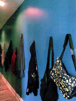
Instead of art

Boring walls? No art to hang? No problem. Here's a spectacularly cheap and easy way to break the monotony of long stretches of wall: hang your clothes. Just shove some screws into the wall at varying heights and hang your most interesting (or most frequently used) clothing. In my front hallway, I've hung all my outerwear and bags. It not only makes it way easier to find sweaters, but also gives the hall the benefit of some extra colour. Win-win!

Labels: , , , , , , ,

Friday, October 3, 2008

Spoon napkin ring


Yet another use for old spoons: Supremely awesome napkin rings.

Labels: , , , , ,

Thursday, September 18, 2008

Very clever blinds

I had an idea, coming up to a month ago, that i absolutely need to do. While I was moving and had a front room full of boxes, I got to thinking about what people would see if they were to glance at my window. Wouldn't it be awesome, I thought, if I had blinds that had a great big picture of a beautiful, well decorated room printed on them? So that's the idea: a venetian blind with a large photo of a nice looking room printed on the outside. That way, any curious window glancer would see, instead of what's actually in your house (or a normal, boring pair of curtains), a room good enough to be in a decor magazine. Awesome? Of course.

Labels: , , , , , ,

Thursday, September 4, 2008

Annual reports for people

People, if you think about it, are a fair bit like corporations. We all have shareholders, people who have an interest in how things turn out. Generally, we're each the majority shareholder in our own life. We accomplish things (and sometimes don't accomplish things we'd like), and set both long and short term goals. To this end, I've been working on my own annual report. Aside from the lack of financial information, it bears a pretty good resemblance to a normal annual report. Of course, mine may pay a little more attention to style than some corporate annual reports.

For your edification and amusement, I present to you the cover of my 2008 annual report:

Labels: , , , , ,

Thursday, August 21, 2008

Barrel of hair clips

Quick idea, as found in my sketch book this morning (I don't remember writing it down, but I'm clearly the one who wrote it): Barrel of hair clips. i want to make hair clips with Barrel of Monkeys monkeys on them. Now I just need to get my hands on a Barrel of Monkeys. Pictures when the clips are ready.

Labels: , , , , ,

An idea for a glossy zine

Lifestyles of the Rich and Famous doesn't entirely appeal to me. It just frustrates me to see people who already have everything. It frustrates me because they have it and I don't. It frustrates me because I think it's pretty boring to look at what people do with their vast riches. These people have no reason to innovate or stretch. I have a better idea.

I've dreamed up yet another darn idea for a (maga)zine. I want to do something called Lifestyles of the Poor but Hopeful. I want to look at what people can do with less. How awesome can you make a cheap apartment on a low wage budget? If I'm to judge by some of the places I've seen, people can still do some amazing things with nothing. It strikes me as far more fascinating to see what clever people with less can do than what boring people can do with more.

I think I want to make a marginally glossy zine on this subject. We'll see how it goes. Maybe look for the first installment at Expozine this year. Maybe.

Labels: , , , , , , ,

Sunday, August 17, 2008

The week-old pizza flowchart

I humbly present to the reading few a handy tool for deciding whether or not to eat the pizza that's been sitting out for a week. I take no responsibility for any un-tastiness or food poisoning that might result from consulting this chart.

Labels: , , , , , , , , ,

Friday, August 8, 2008

An Easier Website

I was in a design meeting at work today. The complaint: Clients ask for "cleaner" or "more professional" websites. So, the boss muses out loud that we can't just adjust and make a website sixty percent cleaner. It struck me at that point that there should be a way.

Solution: Take a representative sample of people. Give them a word (professional, clean, edgy, etc.). Give them a pile of design elements (colours, layout pieces, whole layouts, typography, all that good stuff). Get them to rate each element on how much it matches their perception of the given word. Look for patterns in the responses. Sort by demographics, psychographics, industries. Take the data. make a website generator with a very simple interface: a white screen with a number of slider bars, where each bar represents a scale of zero to one hundred for a given trait (edgy, contemporary, clean, professional...). Any person who wants a website need only key in a little pertinent information about themself, and then move the sliders to get what they want. Press the button. Don't like the output? Move the sliders some more.

So, I'm sensing another thesis. Doctorate, maybe? The research should be fun and doable. It's just the actual programming that I'm a little scared of. But it could make a good collaboration with a computer science person.

If it actually worked, I'd put myself out of the web design business. On the upside, I'd secure my place in other circles.

Labels: , , , , , , , , , , ,

Sunday, June 15, 2008

Very picky beer

Latest project that may never see the light of day: a totally wonderful organic, vegan, Reinheitsgebot compliant, pseudo-lambic beer. Also, it has a made up name and a pretty logo. The whole thing is meant to appeal to a young generation of picky, snooty beer drinkers. If it ever sees the light of day, I'll write about it in more detail. If it flops completely, I'll still write about it in more detail. Until either of those happens, I have a fun secret to keep.

Labels: , , , , , ,

Friday, June 13, 2008

The Craigslist System of Need Organization

I've gotten into the habit of hunting for things on Craigslist. First I was looking for a job, then I was looking for an apartment. I found both. Short of looking for a relationship, I'm running short of things to look for on Craigslist. It does occur to me, however, that Craigslist (or indeed, any classified ad directory) presents an interesting system for organizing life. There's housing, jobs, personals, for sale, services, discussion, and community. Those categories encompass what people tend to want out of life. We need jobs in order to get money to live. We need places in which to live. We need people to share our lives with. We need things to fill our spaces. We need activity. Craigslist basically handles all of the necessities of being human.

I'm thinking, then, that we should use craigslist as a complement to more sober systems like Maslow's heirarchy of needs. I'm not saying that we need to throw Maslow out, as there doesn't seem to be a heirarchy evident in Craigslist, but I do think that classified ads provide a very good measure of what it means to be human at this point in time.

Labels: , , , ,

Monday, June 9, 2008

Cyclist pants

Fact: most cyclists cinch or roll one leg of their pants so that it won't get caught in the bike chain.
Logical conclusion: Make a pair of pants with one leg shorter than the other.

Labels: , , , , , , , ,

Wednesday, May 28, 2008

How to be lazy in the city

I've realized that when I live in big cities, there are far more ways to be lazy than when I live in small ones. Without further ado, method number one for being lazy in a big city.

Don't dry your hair. If you take the subway to work or school, you'll never need to blowdry your hair again. Towel it dry a little, so that you don't drip on others, but there's no need to finish the job. Instead, just stand under the vent in the subway car. There's that spot near the doors, where the ceiling has a great big round vent. On dry hair, it has the effect of mussing. On wet hair, however, it's super handy. If your subway trip is any distance, you'll get your hair blowdried, without running up your own electricity bill or wasting time. Huzzah!

Labels: , , , , ,

Tuesday, May 27, 2008

Kind of gross, but so very useful

Another one for the clever idea file: I have these mugs that have no handles. They're nice looking, they stack well, and they're fantastic for cold liquids. The only problem is that they majorly burn when hot tea goes in instead of cold water or juice. It makes taking tea from the counter to the table ridiculously difficult. I've tried leaving lots of room for rice milk, but it just doesn't cool the mug down enough. Today, I tried putting ice cubes in the tea to cool it down. It worked well, bit it watered down the tea a bit. That led me to an exciting new solution. I decided to put rice milk in the ice cube tray. They idea of rice milk ice cubes seems a little nasty to me. But it seems like a good way to cool down hot tea and add milk at the same time. If it works out, it may become a fixture of my freezer.

Labels: , , ,

Monday, May 26, 2008

Unions as personal shoppers

Some people like to buy North American cars. They think that by buying a GM or a Ford or some such, they're helping to keep jobs in Canada. There's no guarantee, though, that any given domestic car isn't, in fact, made in Mexico. This is the issue: how do you know which car is actually made in Canada? Would you, in fact, be better off buying a Toyota made in Cambridge? Enter a clever idea for a website that I know I'm never going to get around to doing.

If you ask the car salesperson where any given care is made, and where the components are from, s/he isn't terribly likely to have good answers. You could ask the company itself, but that means getting bogged down in automated phone system hell for every make of car you're interested in. It's probably easier to just ask your friendly neighbourhood auto workers union. That's a bit of a hassle, though. It takes a motivated consumer to do such homework. So, why not have a website that aggregates product recommendations from the people who actually make those products? The CAW tells you which cars are actually made in Canada, garment workers tell you which brands give them a reasonably fair deal. I think it would be a very useful little tool. And I'd totally use it, too. But do I look like I need another project in the pipeline?

Labels: , , , , , , ,

Tuesday, May 20, 2008

My version of Cinderella

I'm sure that every kid (Or maybe every girl. I suppose it's a pretty gender specific story) has their own version of Cinderella. It's the version that they hear at bedtime, the version that they've added to and that they and their parents know by heart. Most likely, the end isn't resolved, because they fall asleep before that point in the story.

I'm pretty fond of my version. I still use it sometimes, too. When I have unshakable insomnia, the tiniest bit of my very politically correct Cinderella puts me to sleep without fail. Last night, I got to thinking that my version is a little strange. Most of the time, Cinderella's father is a widower. Not so in my version. Instead, her mother isn't absent because she happens to be a super important globe trotting archaeologist. My land far far away isn't a straightforward kingdom, it's more of a constitutional monarchy. You can tell that I added the constitutional monarchy bit later in life, can't you?

I've decided that it might be fun to actually put into writing my version of Cinderella. I am concerned, however, that trying to write it might put me to sleep.

Labels: , , , ,

Thursday, May 15, 2008

Dwayne is an adjective

I've added a new word to the ginger to English dictionary. The word is "Dwayne." It is, as the title of this post suggests, an adjective. It is an adjective that describes the offshoots of a peculiarly Canadian state of being. To be dwayne, something must possess the characteristics of an nth generation, folksy, down home Canadiana. Getting iced coffee at Tim Horton's instead of a snooty coffee shop is dwayne. To be dwayne is to be friendly, a little old fashioned, and hoserish. It really is a fantastic word. It can be applied to so many things. My deepest apologies to all of the people named Dwayne in the world.

Labels: , , , ,

Saturday, May 10, 2008

More on video stores

First of all, I need to point out that Movieland is the only name for a video store. It's like calling a bowling alley Bowlerama. It's just the natural order of things.

So, I was in Movieland the other day (seriously) and I decided to carry out a little preliminary research for my video store study. I had a little chat with the guy at the counter. I asked if he'd ever had anyone in, renting movies and crying. His answer was encouraging. It turns out that there are criers. I am now unreasonably happy on two counts: people who cry in video stores do exist; people who work in video stores are suitably observant and would probably make excellent interview subjects.

The other cool thing I've noticed, in conducting my literature review, is that it's next to impossible to actually do a literature review for this project. I've found one study relating to the impact of mood on movie rental choice. That's as close as I can find to information relating to my topic. That's both good and bad. The good is that I won't be studying the same tired old thing. The bad is that secondary sources will be hard to find. Still, it's darn exciting stuff.

Labels: , , , , , ,

Friday, May 9, 2008

Crying in video stores

Another thing I want to study:

Lots of people watch movies when they feel sad. Where do those people get movies from? Pre-internet, unless they wanted to watch something they already owned, they'd need to go to the video store. That means sad people in video stores. Even if they aren't crying, it should be possible to see who is more upset than the average.

Questions, then: In the past, how often would an average video store get a crier? A sad non-crier? Has the frequency of sad video store customers changed? Has it gone up? Down? If down, where have the sad video watchers gone? Or are people finding different coping mechanisms?

Problems: I don't know how I could possibly dig up information on incidences of video store criers and sad non-criers in the past. I can't imagine that anyone has kept records on that sort of thing. Perhaps it's time for a literature review.

Labels: , , , , , , , ,

Wednesday, May 7, 2008

Future Atlantis

I was thinking the other week about hydroelectric projects. Specifically, I was thinking about the towns that get flooded in the creation of new dam projects. Think: towns evacuated and flooded, buried under new lakes as if they never existed. These towns are the future Atlantises.

Labels: , ,

Monday, May 5, 2008

Bowls and forks

All I want in life right now are a bowl and fork that are meant to be together. I enjoy eating out of bowls, but it drives me crazy to not be able to move a fork properly around the edges of a bowl. If someone would make a fork that had the same contour on the side as the bowl it was meant to fit into, my life would be complete.

Labels: , , , , ,

Sunday, April 27, 2008

At least two people

I was looking at a piece of design the other day that I just didn't get. It was a handbag with a graphic on it. It didn't speak to me. However, looking at that bag, something occurred to me: in order for a design to appear in the wild (that is to say, on a bus, in a food court, on a coffee table, whatever, as long as someone has bought it), at least two people need to understand it and believe that it is a good idea. The designer needs to think that it might be a good idea, that someone else might want it. Someone else (a consumer, for example) needs to agree with the designer and buy that design. I know that most of the time, far more than two people will believe that the idea has potential. I like this, though, as a rule. For a design to appear in the wild, at least two people need to understand and like it.

Labels: , , , , ,

Friday, April 11, 2008

Kitchen mitre box

I've just had the silliest idea ever. This is the ultimate in excessive kitchen gear: a kitchen saw and mitre box. Get perfect right angles on your bread slices! Carrots, sliced at 45 degree angles! It could revolutionize the geometry of food.

Labels: , , ,

Door bed

This is something I've been meaning to make for a while: Get some old doors (maybe six or so) from the ReStore or some other similar used hardware place. Take two and attach them together, side by side, with something quite strong like a few strips of metal bolted legthwise across the join. Do the same thing with two more. Stand the two sets of double doors up on end about six feet away from each other. Take the remaining two doors, with their long edge on the ground, and attach them to the double doors so that they form a box type configuration. Strong hardware is a good idea. After that, just throw some rails and slats into the whole thing. Ta da! Bed made of old doors. It's sturdy, it's more interesting than an IKEA bed frame, and it's cheap, too. Now I just need to get around to making it.

Labels: , , ,

Sunday, April 6, 2008

Test all the children

When I was in school, every math teacher I ever had got treated to the frustration of trying to make me show my work. I never knew how I got to the answers, I just did. There was no process to grade on the test, no way to see if I was doing it the right way. Not showing my work was, of course, a Bad Habit. Now that I look back at it, I think that life might have been a little less frustrating for my teachers if they'd had a little background on the way I work and what sort of personality I have. Being an INFJ, I have the habit of intuiting, of not knowing why, but just knowing. That was my problem in math.

My thought, then, is that instead of waiting years for university career counsellors to do the testing, people should be tested on day one. I suppose that means having five year olds doing personality tests, although I'm sure there's a more humane way to do it. Every teacher knows that different people learn differently. Why don't they act on that? If we could sort out how children could best succeed, and if they could be taught in an appropriate way, school might become a lot less frustrating for everyone involved.

Labels: , , , , , ,

Thursday, April 3, 2008

Urban mini-forests

A fun strategy for getting more green space and biodiversity in cities: In cities with wide sidewalks, tear out a strip a couple feet wide, next to the road. Lay in a good supply of soil and other necessaries, and then plant a micro-forest. Instead of those wussy single trees in grating, you'd wind up with a nice sound break between people and cars, as well as a habitat for urban wildlife and a good drainage system. It's a win for everyone.

Labels: , , ,

Monday, March 31, 2008

Food value of a t-shirt

Here's an idea I've been hoarding for a while: I want to take a t-shirt to a food testing place and get the nutritional value figured out. I want to know what vitamins it has, protein, calories, fibre, all that stuff. I like the idea of going completely overboard with labelling. So I'd really like to see a shirt that has a hang tag with nutritional info. It's purely useless information, unless you plan to eat the shirt, but still, I think it could be an entertaining gimmick, if nothing else.

Labels: , , , , ,

Sunday, March 30, 2008

A more attractive smoke detector

As far as I know, all smoke detectors are off-white. Presumably they're off-white because most ceilings are off-white. What if I don't have an off-white ceiling? You're not supposed to paint a smoke detector, so how do you get a smoke detector that matches a colourful ceiling? I propose smoke detectors in various colours. It's not difficult to just do the plastic in a colour other than boring off-white. I know it isn't practical to make smoke detectors in every colour that a ceiling could conceivably be, but I for one wouldn't mind having a turquoise smoke detector. It might make my off-white ceiling a little more interesting.

Labels: , ,

Friday, March 28, 2008

ginger to English dictionary

I find that I have a kind of obfuscated, often overly whimsical way of writing. I also make up words when I feel the need. All of this contributes to a use of language that I'm not entirely comfortable classing as English. I ran into that problem today. I was writing an email and noticed that although it sounded nice and had good use of rhetoric, it might not be a practical email. Email, being a perfect medium for quick and concise communication, might not be the place to be excessively narrative. That meant that after writing it, I had to figure out how to translate my own writing into proper English. It left me thinking that I need to a) write a ginger to English dictionary and b) make one of those awesome little translation tools for ginger to English conversion. I now know what my summer project will be: I need to start listening to what I say, sort out how my use of English differs from the norm, make a dictionary based on those results, and then figure out how those translating widgets work. Should be a good time.

Labels: , , , , , , ,

Tuesday, March 25, 2008

On being foolish

I thrive on ideas and get high by getting things done. When I fall into a funk, it's usually because I haven't done anything interesting recently enough. Of course, I'm not equipped to act on all of my ideas. Not acting on ideas is what gets me into a funk. How do I deal with ideas that I can't act on? One solution is to write them down. That's what this blog is for. A more energizing solution, though, is to practice being foolish.

People aren't foolish often enough. I don't know why. Maybe they want to look good. Maybe they want to avoid failure. I, however, see no reason not to be foolish. Foolishness is the stuff of life. There's very little that can go wrong. And it provides a great rush. Besides, as the old cliche goes, nothing ventured, nothing gained. The more times I try and potentially fail, the better my chances of actually succeeding.

How does this foolishness work, then? One form it takes is the following: grab an idea that I can't possibly act on myself, think of a company it might interest, call them up and pitch. More often than not, they aren't terribly interested. Even if they are, I know that more likely than not, I'll never get anything out of it. It doesn't matter. It's the high of putting the idea in a place where it has even just a little more potential. It does nothing in my head. It does nothing in my blog. If I let it loose in the wild, it probably won't do anything, but it might. It's a very tiny chance, but very tiny is bigger than zero. Plus, I get more practice at being foolish and fearless. Not to mention the high.

Labels: , , ,

Saturday, March 22, 2008

Carpets in kitchens

We don't carpet our kitchens. I don't see a good reason for that. Think: What makes a kitchen inherently bad for carpeting? Food preparation takes place in kitchens. It could cause a mess if bits and scraps were to fall onto the rug. Fine, but how many people are actually very messy cooks? Scraps can cause a mess on the way from counter to garbage bin. Fine, but why not just install an opening for the garbage bin in the counter and sweep everything in? Kitchens are high traffic areas. But they're no more high traffic than the rest of the house. I don't see a reason why kitchens shouldn't be carpeted. After all, dining rooms in restaurants are carpeted, and they see far more falling food scraps and foot traffic (with shoes!) than an average kitchen. Yes, restaurants with carpets tend to get vacuumed every night. But as I said before, they get much more traffic than the average home kitchen. I think that carpets in kitchens could be highly feasible. I advocate the use of the kitchen as a secondary living room. Kitchens are, after all, warm and central. They play an important role in life. More carpets, more arm chairs, less utility. Most people don't use the utility anyway.

Labels: , , , , ,

Wednesday, March 19, 2008

Human Backgammon

Everybody loves giant scale chess, right? Three foot high plastic pawns are irresistible. I humbly propose an addition to the giant boardgame category: Human Backgammon. Use people instead of the little round pieces, preferably one group wearing black and one wearing white. Chalk out a giant backgammon board on the road or a similar surface and make participants pile on top of each other. It's more fun than cows playing bingo! Full contact, human scale backgammon: Oh yes.

Labels: , ,

Sunday, March 16, 2008

Instead of shooting shotguns at cans...

Here's a new idea for a fun passtime: Throw romance novels at Barbie dolls. It's like bowling or those carnival games with the water guns, only way more fun. Seriously, you can get a good throw with romance novels. I've tried it. They have a nice heft, but they aren't sturdy enough to actually damage things. And it's amazing catharsis.

Labels: , , , , ,

Friday, March 14, 2008

Conventional media as curator

I'm going to draw a parallel. If I want to see art, there are two things I can do. I could go online and do a search for "art." I'd get over a billion hits (check it yourself if you want to make sure). I'd get to sift through a whole world of art, opinions about art, art history... (Suspend your comments for a moment, if you will, about the non-originalness of the art online. I know that I won't get to see the real painting. But that's not the point of my argument. Forget about it.) My other option would be to go to an art gallery. Doing that would give me access to a limited amount of art, filtered through the perception of a third party. For it to show up in an art gallery, someone has to curate it. I get to look at what they think is interesting.

I think that it would be good for conventional media to operate that way. Let's have an example: Before the internet, it was alright to show one TV show in one country and a different one somewhere else. That's still how it happens, but I'm not sure it's okay any more. If a TV show airs in the UK but not in Canada, and I want to watch it but have no legal way to do so, what am I supposed to do? Am I meant to just not watch it at all? Or do I wait for the DVD to come out and then break the encryption? Or subscribe to digital cable for one show? That's no fun at all. It means that as much as I may want to watch something, there's no sensible, legal way to do it. Why don't they show me what I want to watch on TV? The standard channels only have so much space in their schedules. They have to make decisions about what they think will be successful. They don't have the resources to cater just to me. And yes, I know I could just get BBC Americas or something, but it comes with a large cable package. In order to get one show that I want, I'd have to sign on for a whole lot more. Not very sensible if I don't actually want to spend my free time in front of the TV. So, there's no easy way for conventional media to get my viewership without alienating another large chunk of the viewing public. There simply isn't enough time in the day to accommodate me.

There is, however, another medium that can target individuals quite well. Guess what it is. Did you say The Internet? You're quite right. The internet has all the space necessary to show everyone just what they want to see. That's pretty great. But there are some problems. For one thing, with enough space to make everyone happy, it's sometimes hard to find what you want. Take the art analogy above. A billion hits for the word "art." I'd have to narrow my search down quite a bit to find something that I actually wanted to look at. But that's another problem. Going to the art gallery, or watching TV, or listening to the radio gives me the opportunity to find new things. I might not have known that I'd like it, but when someone else presents it to me, wow! It's a whole new world.

We've established the strengths of conventional media and new media. Conventional media is good at filtering things, at presenting new things to viewers, at curating. The internet, on the other hand, is far better at distribution. You can actually fit all those individual tastes onto the internet. I think that the answer, then, is to make the two work together. Conventional media should become an arbiter of taste, a more curatorial venture, and should leave distribution to new media. Both media could play to their own strengths instead of the constant fear and competition that the current model provokes. Wouldn't that be nice?

Labels: , , , , , , , , ,

Tuesday, March 11, 2008

Designphone

There's a very clever idea that came out of a BS session at school a few weeks ago. It was break, we were sitting at the back of the room, trying to troubleshoot a project that one of our number was having trouble with. Because many hands make light work, and because people further away from the project generally have more ideas about it, we managed to make some suggestions and come up with some solutions. We're lucky, though: at any given time, there are about fifty people we can go to and discuss issues with. That's an environment that you really only get in school. The informal workshopping sessions get fewer and farther between after graduation. That's when the idea came. Why not, we asked ourselves, offer that kind of environment for professional designers? Why not, for example, have a toll free phone number that designers can call to talk about their work related troubles?

To the group at the back of the room, it seemed like a great idea. We'd call it Designphone and it would be staffed by volunteer designers and design academics, ready and raring to help sort out creative problems.

To me, it still seems like a great idea. I determined, the day we came up with the idea, that I would find some way to implement it. And then I started doing the numbers. Phone line(s), office space, toll free number, snacks to put in the office fridge (if you expect people to do pro-bono work, you should at least feed them something): it all costs money. Where does the money come from, then? I thought that the Canada Council for the Arts might be a likely candidate. They support artist run centres and encourage new media works. But wait! I don't qualify for their grants. They don't give money to students.

So, here I am, sitting here with a pretty awesome idea and no idea how to fund it. I guess I'll have to find out who else funds this kind of thing, or just wait until I graduate and then apply for a grant. We'll see.

Labels: , , , , , ,

Sunday, March 9, 2008

Capitalism for butterflies as retail concept

Give me a year, I'm going to do this: Capitalism for Butterflies could be made into a workable retail concept. Take a store, give it a consistent, overarching name, and then change what it does, how it looks, how the branding works every once in a while (when boredom strikes, when the inventory runs out). It would become a destination just because it would completely lack consistency. Look at the original Capitalism for Butterflies post to get a better idea of the model.

Labels: , , , ,

Talent agents for designers

Writers have literary agents. Actors and models and musicians have talent agents. Artists often have galleries to represent them with buyers. Why don't designers have anything like that?

Being the type of person who doesn't actually enjoy networking or constantly looking for work, I'm sick and tired of doing my own legwork. I've often thought that I what I need is a personal assistant to deal with people for me, but this morning I realized that I was wrong. What I really want is an agent. I want someone to round up buyers and show them my work if it fits the bill. I need someone to look after my interests in the creative industry, because I'm tired of doing it myself.

This all leads me to believe that there should be talent agents for designers. As far as I can tell, such a thing doesn't exist yet. In a case like that, I'd normally try to jump on the concept and be the first one in, but this time around, I'm not so sure. After all, this whole idea stems from my distaste for networking.

Labels: , , , , ,

Wednesday, March 5, 2008

Skate parks for longboarders

I'm being cabin fevered half to death. Spring isn't official for another two weeks and Montreal winter doesn't give up without a fight. Just walking on the snow covered sidewalks is cardio. But it's not the kind of cardio I want. For the past couple of weeks, I've been desperately wanting to go longboarding. That's clearly not feasible due to the snow, ice, road salt, and other winter things. If only, I thought to myself today, there were some kind of indoor place to longboard. A moment later I mentally kicked myself. Skate parks are everywhere. But that still doesn't solve my problem. I'm not really interested in kicker ramps and quarter pipes. That kind of thing doesn't work as well on a longboard.

To cure my cabin fever, I propose indoor longboarding courses. Build them in old warehouses and other large places with cheap rent. Just fill the place up with synthetic hills. Some can be steeper than others, some can be for racing and others for cruising. After all, longboards are becoming more and more popular. Sure, it's partially because they make great transportation, but I think it may also be because they're just plain wonderful. I think it would up the wonderful quotient to be able to keep it up even with snow outside.

Labels: , , , , ,

Tuesday, March 4, 2008

Not book reports, website reports

In grade school, I had to write book reports. They usually talked about the plot, the characters, and other basic things. Because it was grade school, I didn't go into much detail. I didn't analyse much or explore deeper issues of imagery and what lies beneath the basic plot. I was writing a reading response today, but it was a little different from the usual. Instead of an article, I was meant to be responding to some websites. As I wrote, it started looking suspiciously like one of those book reports from grade school. So, I'm wondering if, in the future, children in grade school will write website reports. They could discuss what the website is meant to do, the basic layout and structure, what kind of interaction it allows (if any), that kind of thing. Here's to a new artform, then. Or, if not an artform, a new kind of busywork for teachers to assign to small children. At least it promotes media literacy.

Labels: , , , , ,

Monday, March 3, 2008

Capitalism for butterflies

I have this habit of starting little micro-businesses for individual occasions and situations. I take different things that I'm good at, different trends that I see happening, and different environmental stimuli (impending small press fairs, craft festivals, that sort of thing) and build a business to meet the need. In short, I do something that interests me now, for a limited period of time, and hope to benefit others. I then move on before the concept goes stale. I think there are other examples of this in existence, but I may take it to an extreme.

I'm calling my habit Capitalism for Butterflies, because it does a lot of the same things that butterflies do. Think: Butterflies live short lives, being pretty, flitting from place to place, pollinating. That's what an ideal Capitalism for Butterflies business does.
It exists for a short period of time, based around one good idea that is often trend based. It isn't meant to have staying power. If it works well, it pollinates. It makes the people who encounter it happy, it builds personal brand equity for the people involved, and the whole thing ends before it gets old.

A recent example of Capitalism for Butterflies: no poetry press. I started no poetry press specifically for Expozine. I got it into my head that I would show at Expozine 2007. Roughly two weeks before Expozine took place, I made a website, dreamed up a few zines, did the covers for those zines, put those on the site, and then registered myself for Expozine under the no poetry press banner. By the time Expozine rolled around, I had a catalogue of around ten zines/small books and I was ready to go. People showed up at my table, some of them actually looking for me because they'd seen covers that had interested them on the no poetry press site. I sold a lot and loads of people went home happy with copies of Flow Chart Comics, The Adorable Seven Deadly Sins and Love Poems for Undeserving People. no poetry press hasn't been active since. The website still exists, I still have copies of zines that didn't sell as well, and no poetry press might just register for Expozine 2008.

The bottom line, though, is that a Capitalism for Butterflies business doesn't need to exist all the time or for long. Good Capitalism for Butterflies businesses are low commitment, low investment and extremely compelling. They don't need to last forever. It's like having loads of different product lines under the umbrella of one company. The parent company in this case is just an individual. Every Capitalism for Butterflies project I start gets the ginger coons brand a little more equity. No loss, lots of gain and never any stasis.

Capitalism for Butterflies is a profoundly fluid business model. And that's a very good way to be.

Labels: , , , , ,

Friday, February 29, 2008

Thought Bubbles

I want to make some very small, very low power, sculptural computers. They only need to be able to access wifi networks and browse websites (I'm thinking Wikimedia Commons and Google image search). They very nearly qualify as wearable computers. They're shaped like thought bubbles and are worn sticking up from some kind of hat or other person to computer interface. The idea is that the wearer would be able to grab an image from the internet and display it on their thought bubble screen. It would give the adorable illusion of being in a comic book, and it would give others a little insight into the thoughts of the wearer. Neat.

Labels: , , , , ,

Friday, February 22, 2008

A novel use for spoons

I've come up with a clever use for the extra spoons I had kicking around in my materials cupboard. I was thinking the other day that I needed a place to hang clothing that wasn't to be worn immediately, but that would be impractical to put in the closet. I went into my materials cupboard to look for some kind of hanger. I noticed a small baggie of spoons. Spoons are quite nice, because they have a round bit to hang things on, as well as a longer bit that turns out to be ideal for slotting in between the louvres of closet doors.

The technique, then, for turning spoons into fantastic clothing hangers: Take spoon. Bend twice, fairly sharply (about ninety degrees), in opposite directions. It doesn't really matter where. It's all a matter of taste. Then, in my case, shove the non-spooney end between the louvres of the closet door. This should leave an L shape hanging down against the closet door, with the bowl of the spoon jutting out for clothing hanging purposes. In this incarnation, the spoon hangers can't carry much load, because the louvres are a little delicate, but I'm sure it could also be installed into a wall. In fact, wall mounted spoons would only need one ninety degree bend to work properly. In the version I've done, though, the spoon hangers are an excellent place to hang shirts. Yay! A handy weekend project for those with excess cutlery.

Labels: , , , ,

Wednesday, February 20, 2008

Dumb waiter update

I think I know how to make my super-slick dumb waiter work. The new idea is this: Picture an elevator. A normal one has one shaft in which one capsule goes up and down. That's fine as far as it goes. Mine is a little different. My elevator has two shafts, running side by side. They connect at the top and bottom. Also, instead of having one set of cables, mine still only has one set, but it goes in a loop. So, the two elevator shafts (or dumb waiter shafts, if you prefer) share one cable. There's a pulley system at the top and a pulley system at the bottom. Multiple little capsules are attached to the cable. Here's where it gets cool: the capsules are only attached at one point (think of a ski lift) so that they have their orientation controlled by gravity. That way (like a ski lift) I can have multiple capsules going around the double-shaft-elevator-loop-cable-thing (and yes, that is the technical term for it). The result: a dumb waiter that can have multiple courses loaded into at once in the kitchen, each of which can be retrieved individually upstairs. Success! Now I just need to sort out the little details. For example: how will I actually build it? And where?

Labels: , , , ,

Monday, February 18, 2008

The garden as a metaphor for the city

Flying into Toronto the other day, I got a chance to look down at the buildings surrounding the airport. It struck me how many houses there were, and how few taller buildings. I then started thinking that cities could be viewed like gardens. Houses and other low-lying structures are ground cover. Basic tract houses remind me of grass. They look very homogeneous from the air. Taller buildings are plants. They stand out above the ground cover, but with the way architecture has been unremarkable in the past century, very few of these plants can be called flowers. We seem, also, to be missing shrubs. I don't think we have the buildings yet that could be likened to shrubs.

So, how can we make our cities into better gardens? More flowers. That means more variety, more colour, and taking more chances with architecture. Some different varieties of ground cover might be nice, too. And shrubs: I'd like to figure out what architectural shrubs could be.

Labels: , , , ,

Friday, February 15, 2008

A new aspiration

For months, I've been kicking around the idea of doing a restoration job on some kind of decrepit warehouse building, if I ever manage to find one. A clever new idea has just solidified in my mind. I've realized that I'll have to put my dining room over my kitchen, whether I do that loft-wise or some other way. Why does the dining room need to be above the kitchen? I want a dumb waiter. I think that having a dumb waiter is absolutely necessary, and quite appropriate in something like an old industrial building. Now that I have that part, though, I'm trying to sort out how to reinvent the wheel, with the wheel in this case being the dumb waiter. I need to sort out how to do a dumb waiter that doesn't require anyone to be in the kitchen loading it. At this point, I'm thinking that maybe some kind of a water wheel type look with multiple boxes might be a good way to keep a few different things in at once. Although that idea presents a different set of problems. We'll see.

Labels: , ,

Wednesday, February 13, 2008

Racing stripes

I've been thinking lately about what could be potentially the most awesome thing ever. I want to paint racing stripes on buildings. I think that it would be delightfully incongruous to see go faster stripes on something that can't possibly move. It would have to be easily removable paint, of course. No point in doing damage.

Labels: , ,

Tuesday, February 12, 2008

Blinders

Back in the day, when people used horses to get around and to drive ploughs, they had these blinders that they'd put on the horses. The blinders were essentially just a black thing on either side of the horse's head, blocking the peripheral vision. They were meant to keep the horse looking ahead, to stop it from being distracted by things happening off to the side.

I was in Pharmaprix today, at the checkout. You must understand, before I go on, that I don't care what celebrities do. I don't want to know about a new miracle diet, or twenty hot tips for steamy sex. I just don't care. It's problematic, then, to be constantly assaulted by the racks of magazines at the checkout. So, I'm thinking that I need to get myself some blinders. That way, I'll be able to direct my attention to the task at hand and get out of the store without being distracted by things that will only irritate me.

Labels: , , , ,

Rooftop patios

Downtown Montreal is full of buildings with flat roofs. Not only are the roofs flat, but they're built strong enough to stand up under snow. Despite the wealth of strong, flat roofs, there's a serious shortage of rooftop patios. I find that there's something wrong with that situation. To me, it seems simple that strong, flat roofs should mean lots of wonderful rooftop patios. No one would even need to do very much. They'd just have to put up some barriers to minimize their liability. I think that the denizens of the office buildings would seriously benefit from a little fresh air and a fantastic view.

Labels: , , , ,

Monday, January 28, 2008

solution for sanitary napkin disposals in public washrooms

Warning: involves discussion of personal hygiene products.

I got to thinking this morning about the little metal boxes in public washrooms. They've always bothered me, mainly because they just don't seem like they can possibly be clean. Also, I went to a high school where people would just pile the paper bag full, instead of putting one pad in a bag and then removing the whole works to the main garbage bin. That's the problem: we have a paper bag dispenser that looks like a very small garbage bin. By putting a lid on it, users are encouraged to just leave their waste in it. The lid also poses a sanitation problem. Let's face it, do you really want to touch something that someone else has touched when you know that everyone using it is coming into contact with some fairly private bodily fluids?

So, what's my solution, then? Install paper bag dispensers that actually look and act like paper bag dispensers, instead of mini garbage bins. Just make something like a paper towel dispenser and fill it with little paper bags. Users will be forced to take the bags to the main garbage bin. Problem solved. Each user only touches one bag, and there's nowhere to leave the bags in the individual stall. Put a sticker on the dispenser, if you must, that tells people not to flush their bags.

Labels:

Sunday, January 27, 2008

idea for a print

(text is monospace, with letters running together, spaced over three lines)

you'll call me when you want someone to introduce to your mother

Labels: