Tuesday, March 23, 2010

The Unicorn Tutorial

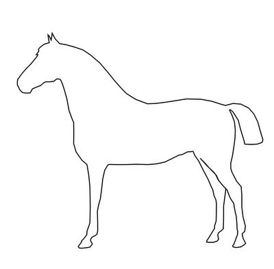
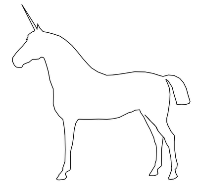
I remember my first introduction to nodes and vector-based illustration. When I was about seven years old my father, who was a high school tech teacher at the time, sat me down in front of Corel Draw 3. Up until that day, I had seen the program as a repository of clip art, not knowing what I could actually do with it. He loaded a clip art horse. Everything changed when he showed me the node selection tool. The previously clean line drawing of a horse suddenly had a mass of dots all along its outline. He explained that these were nodes, the points defining the shape of the horse. And then the magical bit: he had me select the node at the apex of the horse's ear. When I clicked and dragged that node, the horse changed. The ear elongated, following my mouse. He instructed me to move the node a little distance and then drop it. The horse was no longer a horse. Elongating that ear had turned it into a unicorn.

Since then, I've learned more about how nodes really work and what can be done with them. But that lesson still sticks in my head. It was an incredibly powerful introduction. It started a (so far) life long love of vectors. A love of all their extensibility, elegance and possibility. So today, I've drawn a horse. It's not quite like how I usually draw. It's just an outline, no shading, nothing fancy. It's a horse with two pointy ears, one of which has a little node at the apex. I've uploaded the .svg file to the Open Clip Art Library (here). If you want, you can download it, open it up with Inkscape or whatever vector manipulation program you use, and turn it into a unicorn. I've put pictures below, so you can see my unicorn. And the next time I talk to anyone about the joys of drawing with vectors, I'm going to start with the unicorn tutorial.

Labels: , , , ,

Tuesday, January 12, 2010

The scribble couch progresses

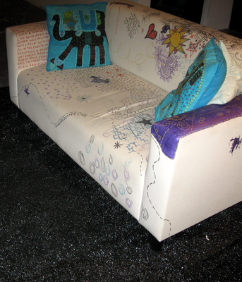
I'll admit to drawing on furniture. To me, a white couch is an excellent opportunity to do something interesting. So there's the scribble couch. It's perpetually in progress and has been for the last year and a half. Whenever someone comes over, they get handed to fabric markers. At the moment, it's covered in poetry, tic-tac-toe games and some pretty darn nice curvy floral patterns.

Labels: , , , , ,

Monday, January 11, 2010

Chalkboard fridge

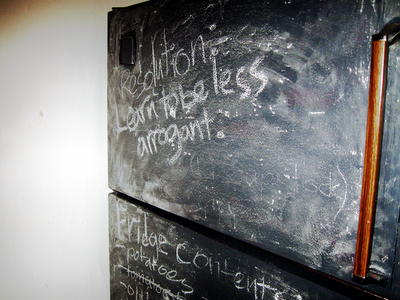
Fridges are great. They're great when covered in pages from old comic books, they're great bare and I'm increasingly of the opinion that they're great when they double as chalkboards. I say that, of course, because a few months back (call it October 2009 or so), I painted the fridge with chalkboard paint. It's handy for keeping a running list of groceries in stock, shopping lists, or in the case of the front of the freezer at the moment, my resolution for 2010.

Labels: , , , , , , ,

Saturday, January 9, 2010

Truth in design, Truth in production

There's a design principle that I've often taken for granted. Distilled down to one word, it's Truth, with a capital T. But what is Truth in design? How does it apply? What, in short, does it mean?

There are two examples I like to use when explaining Truth in design. They both have to do with materiality. Here goes. Say you're designing a poster. You want it to look a little old school, a little messy, but still a little official. In short, you want your typography to have the look of an old-timey typewriter font. An easy reaction, when pressed for time, is to grab a typewriter font. I'm not talking about Courier, but instead about something that tries to mimic the little errors and ink blots of a worn out typewriter. But that font isn't very true. Use it and you'll find that all the letters look the same, each instance of a letter exactly like its siblings. It's not organic. It lacks soul. Not only that, but it's obvious that it wasn't done with a real typewriter. Then there's the truthful way. You dig out the old typewriter and honest to goodness type out the text you want. Scan it, clean it, integrate it into the poster. Each letter is a little different and the whole thing comes by its blotches honestly. In short, it's true. It's meant to look like the product of a typewriter and it does because it is.

Truth, however, is also utilitarian. That's where my other example, the one with the corkboard, comes in. Say, for the sake of argument, that you want the look of pictures or notices pinned to a corkboard. Sure, you can open up your graphics program and plunk a stock texture of cork in. You can drag whatever you want onto it, even simulate the shadows cast by the tacks. But why would you? In real life, light casts shadows for you. If you actually print the photos (or notices, or whatever) and pin them to a real cork board, it looks right, automatically. Why add shadows when light can do it for you? If you try to do it digitally, you'll miss something, or agonize for far too long in order to not miss anything. Do it in reality and the details are taken care of. Nature does half the work for you.

In essence, Truth is about materiality and reality. It's about doing it properly, with the right materials. In an idealistic sense, it's about knowing that you've got something right, that it is how it should be and isn't just an imitation. In a practical sense, it's about covering your bases, not by thinking out every eventuality, but by letting reality do the work. It may not always be convenient, but it will always be right.

Labels: , , , , , ,

Thursday, November 5, 2009

Commercial Web Services as Courseware

Setting up an account with any web service provider means a lot. It means agreeing to terms of service, buying into their framework, playing their game. These services are not provided for free for the benefit of humankind. They serve ads and gain revenue. Some of them sell personal information to third parties. At the very least, when you sign up for a free web service, you enter into a legal agreement with another entity and also into a business relationship, wherein you allow them to sell your attention to others. While most people don't view it as a choice, it is. And it is an individual choice. It should be made, in an informed way, by an individual, without coercion.

Educational institutions decide what their students will learn and which tools they'll use in order to learn. Traditionally, this has meant deciding which textbooks and articles will be read. As any educator bombarded with textbook samples knows, this is not a strictly academic decision, but one with profound financial implications for many different stakeholders. It is in the power of the educator to decide which textbook all her students will have to purchase.

Increasingly, the tools of education are more than just textbooks. The new tools include courseware and software. Academic institutions decide whether to tie their students to Blackboard, Moodle or any other courseware system. What's more, those institutions decide how zealous they will be about the enforcement of their courseware standards. Will they allow one faculty/department/professor to diverge from the norm?

The issue, of course, goes far deeper than courseware. And this is where we come back to the initial discussion of free web services. Educators in less zealous institutions may choose to abandon standard courseware in favour of a third party solution, often a service already favoured by students. A professor may, for example, choose to conduct course discussions in a Facebook group devoted to the class. This decision presents problems. Sure, most students are probably already Facebook users. But it can't be taken for granted that they all are. And what of those who don't already use the service? In order to engage with the class, these students are forced to enter into a legal and (effectively) financial agreement with a third party service provider. And if they don't, they lose out. That dynamic smacks of coercion.

I don't mean to be negative. I am, in fact, all for the idea of using accessible, available, ostensibly free tools with which students are already comfortable. But it bears thinking about. In an attempt to make learning accessible and integrative, an important element of choice may be lost.

Labels: , , , , , ,

Sunday, September 27, 2009

Popewood

Many authors and artists are said to have cult followings. Margaret Atwood is a fine example of such an author. So, perhaps she should be given the trappings of organized religion. Hence, a graphic I'm calling Popewood.

Labels: , ,

Tuesday, August 18, 2009

Teachable creativity components

I posted last month about methods for teaching creativity (http://adaptstudio.ca/blog/2009/07/teaching-creativity.html). I now have some more developed ideas on the subject. Here's my shortlist of teachable skills that I think are essential components of creativity.
  • critical thinking
  • observation
  • brainstorming and idea generation
  • open mindedness/lowering of mental filters
  • perseverance
  • sorting and association of concepts/ideas
  • curiosity
  • non-standard problem solving OR solving the same task in a different way
  • extrapolation
  • creating within constraints

Labels: , , ,

Wednesday, July 22, 2009

Teaching creativity

Creativity is so often seen as an innate and unteachable skill. You either have it or you don't. The hydro reader once walked into my house and decided I must be an artist, seeing the flow charts on the walls and paint splattered door mat. I said anyone could do it. He begged to differ. So, creativity is rarefied. If there's one thing I'm convinced of, though, it's that creativity can indeed be taught. But how?

How do you teach creativity? There aren't specific hard skills that go along with it. It's largely about process and mindset. Teaching someone to draw doesn't give them creativity, simply a set of skills that help creativity be actualized. What, then, do we put in the creativity toolkit? Which mental processes go into creativity?

Labels: , , ,

Thursday, June 25, 2009

Lawbot: done.

I've mentioned Lawbot and the Case of the Missing Copyright Infringers before. Well, now it's done. Or at least, it's in an intermediate state of done. If you click the above link, you'll find a pretty fun (if I do say so myself) text-adventure game that explains certain elements of Canadian copyright law. It may later get either sound or visuals. I'm not sure yet. Here's the little artist synopsis that I wrote about the project:

Lawbot and the Case of the Missing Copyright Infringers is, above all, a pragmatic project. The aim behind Lawbot is to broaden the public understanding of Canadian copyright law. Lawbot aims to do this in an approachable, perhaps even fun, and certainly accessible way. To this end, Lawbot borrows thematic elements from both adventure games and spy movies, weaving a slightly absurd, proto-futuristic kidnap-story narrative. Lawbot employs heavy-handed allegory and a pinch of copyright history to get across the point that a litigious approach to intellectual property protection isn't sustainable. Visually, Lawbot riffs off of early text based computer games. Lawbot is written entirely in HTML and JavaScript for optimal online usability and distribution.

Labels: , , , , , , , ,

Friday, May 29, 2009

Two bits about tactility

I've had the relationship between tactility and design/creativity on my mind lately (see: Tactile interfaces for digital making). And of course, when I get to thinking about something, I find that I start seeing it everywhere. This week, I've seen two interesting things relating to tactility: one an article, the other an event (both via BoingBoing)

The Case for Working With Your Hands is a thoroughly thoughtful and thought provoking article in The New York Times Magazine. I found that it really highlights some of the issues of working in a knowledge economy, namely lack of self-determination and tangible feedback. The feedback issue is, of course, one of the important cases for tactility.

Next, at Internet Week New York, there's going to be a tangible interfaces hackday. This is a good thing. I can't wait to see what clever new ideas for interfaces come out of it.

Labels: , ,

Wednesday, May 27, 2009

Tactile interfaces for digital making

I've got a problem. I've had a lifelong obsession with building things by hand. I love the sensation of seeing something come to life through my efforts. In physical making, there's a certain amount of feedback and consequence. I actually enjoy having to clean the ink out from under my fingernails after screen printing. These days, however, the majority of my work is digital, with very few protrusions into the physical world and with little to no non-digital making. That's gotten me thinking.

I'm planning my day. On my to-do list, I've put the words "update website." I know that I have a meeting later that I'll have to drag myself away from my work to attend. Here's the problem: when I'm only working digitally, it doesn't feel as if I'm actually pulling myself away from anything. The majority of my life, work and leisure time involves interfacing with a screen. Fixing my website doesn't feel like an engrossing task. There isn't a feeling of immersing myself in one thing, mainly because I'm not. I know that in the browser I have open to test my changes, I'll also have tabs going for email and Twitter. I also know that when I leave to go to my meeting, there won't be any tidying up to do. I'll just have to fold down the laptop and go.

It may seem absurd, but I want a way for my digital activities to be a little more demanding. I want to actually need to concentrate and prepare. I want the little rituals that come along with more physical forms of making. I mark things on a physical to-do list because stroking out an entry with a marker feels more satisfying than just clicking on a box. I keep a drawing board because some things are better sketched out by hand than drawn on a computer. How can I make my digital activities more tactile, beyond the standard idea of drawing with a tablet? Why can't I hook a block of clay up to a 3D modeling program and work with hands and knife? And, the big question: what's the tactile analogue of a natively digital activity like web design?

Labels: , , , , , ,

Sunday, May 10, 2009

Open Colour Standard properganda

Something from the Open Colour Standard project that I feel is worth cross-posting here: my ever so lovely OCS properganda (not propaganda) poster. It sells Open Source graphics programs the easy way: by explaining how cheap they are compared to the proprietary stuff. Enjoy.

EDIT (12 May 2009): Here's a new version of the poster with better kerning. And I'm replacing the downloadable one on the OCS website with this newer, more correct version.

Labels: , , , , , , , ,

Tuesday, January 6, 2009

The building blocks of life

Not DNA or anything else anyone ever calls one of the "building blocks of life." I'm talking about real, literal building blocks, the wooden ones that children use to make towers and forts and cities. Except that I'm talking about them in a figurative sense.

This morning, I've determined that life is a lot like a block tower. Here's how the theory goes: We are a building species. We build in both literal and figurative senses. We spend time building habitats, social networks, routines and reputations for ourselves. We are builders. But we're not building with concrete and rebar. We're building with (you guessed it!) blocks. Block towers can be sturdy or not, inventive or not. They can be anything imaginable. There are block towers that fall over if there's a breeze or someone shakes the table. No block tower can stand up to a determined kicking.

So, we spend our lives building block towers. In fact, our lives are block towers. Sometimes, if we really like the tower we've built, we spend ages admiring it. It's such a great block tower that we can't imagine any other. But then, if we're being pessimistic, the fear can set in. What if someone comes along and kicks the block tower down? If we add another few blocks, mightn't it ruin this beautiful tower? Best to leave it as is and hope nothing bad happens. To me, this is a problem. We're builders. Why should anyone spend a life trying to protect their existing block tower?

What's the best way to keep our block towers from getting kicked over? Tear them down before someone else does. We may think that we already have the best possible block tower, but maybe it can be better, or at least different. We need to learn to tear down our own towers. When we're not busy trying to protect the towers we've built, there's way more energy available to imagine and build better towers.

Labels: , , , ,

Tuesday, November 11, 2008

Brain Training

People are just so darn interested in training their brains these days. We come up with all sorts of clever, synthetic ways to keep our brains in shape. We play brain training video games and live in houses that are meant to break the occupant out of normal behaviour. I think we do all that because we've stopped opening ourselves to the organic challenges that we should be encountering. Our lives are so boring and predictable that we feel the need to find ourselves fake challenges.

Labels: , , , , ,

Being profound isn't easy

When very few people knew how to read or write, it must have been much easier to write profound things. Today, with the huge mass of voices, all demanding to be heard and all distributed worldwide via the internet, it's far harder to write things that people will actually pay attention to and remember. We have such a huge volume of information, now. It makes it nearly impossible to actually process and give consideration to everything. And if I blog that sentiment? It's just another bunch of words in our huge wash of constant data.

Labels: , , , , , , ,

Wednesday, November 5, 2008

Subway Ceilings

I avoid looking people in the eye on the subway. In turn, they avoid looking me in the eye. When the subway is packed, there's nowhere to look but at the floor or ceiling. The problem is that I can only stare at the ceiling for so long before I get bored. I never think to bring a book and don't really like the tabloid newspapers they hand out at rush hour.

Solution: Commission art for subway car ceilings. Give commuters something interesting to stare at. Print a magic eye or Where's Waldo sort of graphic up there. Art, puzzles, poetry, whatever. Just no ads. I don't think that subway riders should be abused that way.

Labels: , , , , , , , , , , ,

Tuesday, November 4, 2008

A radical consultancy

The term "ginger group" was recently brought to my attention. Having done my little bit of research about it, I'm now a little bit in love with the idea of a group of people who exist to get everyone else thinking more radically. According to my beloved Wikipedia, ginger groups have traditionally been informal and organic and always within larger organizations.

Here's my clever idea: Create a ginger group for hire. It would essentially be a freelance ginger group, a consultancy that specializes in being radical. Looking for crazy ideas? Looking to get inspired? Hire the ginger group. I really must start such a consultancy one day because, of course, there's no one better for the job.

Labels: , , , ,

Sunday, November 2, 2008

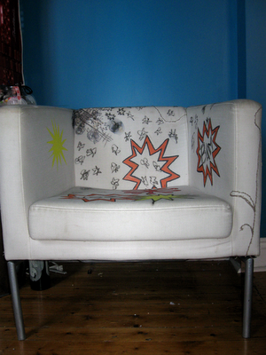
Scribble Chair

Below is a chair that's been in progress for two years. It's my ever so exciting scribble chair. It gets drawn on whenever I'm feeling bored. I'm hoping that one day, there won't be any white visible and the whole thing will be a mass of sketches and scribbles.

Labels: , , , , ,

Friday, October 31, 2008

OCI logo revisited

The OCI logo I was so pleased with yesterday has been replaced by the OCI logo that I prefer today. Behold! Progress! Magenta progress, in fact.
I think this one looks far more dynamic.

Labels: , , , , , , , , , ,

On sensible careers

People try to be too damn reasonable and realistic about the future. I think those are silly and impossible things to be. Everything always changes. How can we expect to be reasonable about the unknown? I don't care if the world will always need engineers and lawyers and accountants. I don't want to be something the world will always needs. Where's the fun in that? I'd much rather be something new.

Labels: , , , , , ,

Thursday, October 30, 2008

OCI logo

I've been building iterations of a logo for a semi-secret project that I'm calling the Open Colour Institute. You can guess what the project actually is, if you want. The important thing at this point is that I've come up with a logo that I think I like. And here it is.

Labels: , , , , , , , , ,

Wednesday, October 29, 2008

The SPCC

There's a half funny, half serious idea I've been kicking around for the last few months. It's called the SPCC, or the Society for the Prevention of Cruelty to Creatives. The idea is twofold:

Part one of the SPCC is a helpline for bored and abused creatives. You're a designer who gets stuck cropping and resizing all day? Call and talk it over. Copy writer stuck with unreasonable deadlines and unresponsive superiors? Call the helpline and strategize. This half of the idea is quite similar to Designphone, an idea I blogged about last March. The main difference is that it would have a mandate beyond just serving designers and would instead be there for creatives of all types. It's part two that gets interesting.

Part two is basically a home for bored and misused creatives. Essentially, it's a retreat for creatives who just can't take it anymore. It would essentially be a sanctuary full of free time, other creative people, and the resources necessary to carry out personal projects. Creatives would be able to come down for a break from the monotony of doing boring, not terribly creative, creative work. It would also offer workshop retreats for open-minded management who would either like to reward their creatives with a break or learn how to be a little more creative themselves. Naturally, corporate rates would be rather different from the rates charged to individual creatives. Proceeds from corporate retreats would go to funding project scholarships for creatives with ennui.

The Society for the Prevention of Cruelty to Creatives: like that SPCA, only instead of saving animals, supporting commercial artists of all kinds.

Labels: , , , , , , , ,

Saturday, October 25, 2008

A manifesto for ginger coons

[Having discussed the idea of mission statements for people, I set about figuring out what I need to remember when times get confusing. The result is the following point form manifesto. I'm posting it because I think several of the points are useful, not just for me, but for anyone else of a similar age and inclination.]
  • I will do things that interest me, come hell or high water
  • I understand that interesting things are sometimes accompanied by boring things. I will find joy in the boring things because they help with the progress of the interesting ones.
  • I must understand that degrees are only pieces of paper and that they may not make me happy or help me along with the things I want to do.
  • I will remember that there are twenty million (give or take) different ways to do the same thing.
  • I must remember to do things because they make me happy, not because I think I'm supposed to do them.
  • I will avoid sulking and stewing and hiding under the covers when I am unhappy. Instead, I will endeavour to take positive action.
  • I will not compare myself to other people. Everyone is different. That's the whole point. There's no reason to try to be the same as anyone else.
  • I will not seek easy answers from outside sources. They don't exist.
  • I must remember that most people do not achieve greatness before the age of twenty or even in their twenties. The people who do so are anomalies. I am not running behind schedule.
  • I measure my own success. People who try to measure my success for me are wasting their time and neglecting themselves.
  • The same goes for me: I have no right or time to measure the success of others. In short: I mustn't be judgemental.
  • I don't have to choose. I can do everything. I just can't do it all at once. I must learn to prioritize.
  • I will learn to excuse myself. I don't need to be right all the time. Changing my mind isn't the end of the world.
  • Grey areas are okay. Sometimes, "maybe" is a better answer than "yes" or "no."

Labels: , , , , , , , , ,

Friday, October 24, 2008

Blogs in print

I've just thought of one of those ideas that qualifies as stupid-smart. So: Blogs use tags. Tags are what allow readers to check out other posts similar to posts that they like. Sometimes, reading things on paper is nicer than on a screen.

My stupid-smart idea: Make little zines or books or magazines of specific tags from blogs. If you were to do that to my blog, for example, you might make a zine based on the "clever ideas" tag. The whole thing would be a compendium of things that I classify as clever ideas.

I'm trying to decide whether this idea has enough merit to actually do. Of course, in the free market spirit, I could just make up a few copies of such a thing, take them to Expozine with me, and see if they have merit.

Labels: , , , , , , , , , , , ,

Wednesday, October 22, 2008

This is how we blog.

Having recently read an article about creativity (which is here, and thank you, Jasper, for pointing it out), I've realized that I'm losing a lot of ideas simply by not getting them down when I think of them. It happened to me again, just this morning, when I thought of something interesting but was busy writing something else. And now I've lost it. I can't for the life of me remember what it was I thought up. As a result, I've decided to attempt to blog every single damn idea I come up with from now on. "That's crazy talk!" you may say. And that's true. It is crazy talk. But I intend to try anyway. So, starting now, more posts, often shorter posts, less curation, more randomness. Oh yes.

Labels: , , , , , , , ,