Tuesday, March 23, 2010

The Unicorn Tutorial

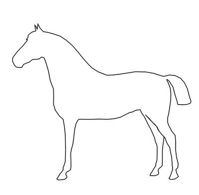
I remember my first introduction to nodes and vector-based illustration. When I was about seven years old my father, who was a high school tech teacher at the time, sat me down in front of Corel Draw 3. Up until that day, I had seen the program as a repository of clip art, not knowing what I could actually do with it. He loaded a clip art horse. Everything changed when he showed me the node selection tool. The previously clean line drawing of a horse suddenly had a mass of dots all along its outline. He explained that these were nodes, the points defining the shape of the horse. And then the magical bit: he had me select the node at the apex of the horse's ear. When I clicked and dragged that node, the horse changed. The ear elongated, following my mouse. He instructed me to move the node a little distance and then drop it. The horse was no longer a horse. Elongating that ear had turned it into a unicorn.

Since then, I've learned more about how nodes really work and what can be done with them. But that lesson still sticks in my head. It was an incredibly powerful introduction. It started a (so far) life long love of vectors. A love of all their extensibility, elegance and possibility. So today, I've drawn a horse. It's not quite like how I usually draw. It's just an outline, no shading, nothing fancy. It's a horse with two pointy ears, one of which has a little node at the apex. I've uploaded the .svg file to the Open Clip Art Library (here). If you want, you can download it, open it up with Inkscape or whatever vector manipulation program you use, and turn it into a unicorn. I've put pictures below, so you can see my unicorn. And the next time I talk to anyone about the joys of drawing with vectors, I'm going to start with the unicorn tutorial.

Labels: , , , ,

Wednesday, February 3, 2010

NATO Phonetic Alphabet Book: S-T

Continuing on with the NATO Phonetic Alphabet Book (see previous post), I present to you the letters S and T.

Labels: , , , , , , ,

Saturday, January 23, 2010

NATO phonetic alphabet book

I like alphabet books. I like A is for Apple, the making concrete of letters that is accomplished by associating them with things. And of course, I like standards. This is why I'm working up a set of illustrations for an alphabet book based on the NATO phonetic alphabet (you know, alfa, bravo, charlie and so on). Below, some of the first illustrations.

Labels: , , , , , , ,

Sunday, November 8, 2009

Panopticoncordia

Because I've yet to kick the habit of drawing Concordia buildings, here's another: the Hall building as panopticon (okay, so it isn't actually a real panopticon, given that it's only looking in one direction, but I couldn't resist calling it Panopticoncordia).

Labels: , , , , ,

Thursday, November 5, 2009

Commercial Web Services as Courseware

Setting up an account with any web service provider means a lot. It means agreeing to terms of service, buying into their framework, playing their game. These services are not provided for free for the benefit of humankind. They serve ads and gain revenue. Some of them sell personal information to third parties. At the very least, when you sign up for a free web service, you enter into a legal agreement with another entity and also into a business relationship, wherein you allow them to sell your attention to others. While most people don't view it as a choice, it is. And it is an individual choice. It should be made, in an informed way, by an individual, without coercion.

Educational institutions decide what their students will learn and which tools they'll use in order to learn. Traditionally, this has meant deciding which textbooks and articles will be read. As any educator bombarded with textbook samples knows, this is not a strictly academic decision, but one with profound financial implications for many different stakeholders. It is in the power of the educator to decide which textbook all her students will have to purchase.

Increasingly, the tools of education are more than just textbooks. The new tools include courseware and software. Academic institutions decide whether to tie their students to Blackboard, Moodle or any other courseware system. What's more, those institutions decide how zealous they will be about the enforcement of their courseware standards. Will they allow one faculty/department/professor to diverge from the norm?

The issue, of course, goes far deeper than courseware. And this is where we come back to the initial discussion of free web services. Educators in less zealous institutions may choose to abandon standard courseware in favour of a third party solution, often a service already favoured by students. A professor may, for example, choose to conduct course discussions in a Facebook group devoted to the class. This decision presents problems. Sure, most students are probably already Facebook users. But it can't be taken for granted that they all are. And what of those who don't already use the service? In order to engage with the class, these students are forced to enter into a legal and (effectively) financial agreement with a third party service provider. And if they don't, they lose out. That dynamic smacks of coercion.

I don't mean to be negative. I am, in fact, all for the idea of using accessible, available, ostensibly free tools with which students are already comfortable. But it bears thinking about. In an attempt to make learning accessible and integrative, an important element of choice may be lost.

Labels: , , , , , ,

Sunday, November 1, 2009

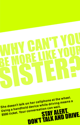
Menacing PSA Posters

Ontario has some new legislation meant to penalize people who talk on handsets while driving. The two groups most likely to talk and drive are young people and taxi drivers. So, in the fine tradition of alarming and mean public service announcements meant to scare people into compliance, I've made a couple posters.

Labels: , , , , , , , , ,

Saturday, August 22, 2009

Isometric Concordia

The farther I get from Concordia, the more I seem to wind up doing representations of it. Below, the major buildings in the Quartier Concordia, towering above a flat downtown.

Labels: , , , ,

Tuesday, August 18, 2009

Teachable creativity components

I posted last month about methods for teaching creativity (http://adaptstudio.ca/blog/2009/07/teaching-creativity.html). I now have some more developed ideas on the subject. Here's my shortlist of teachable skills that I think are essential components of creativity.
  • critical thinking
  • observation
  • brainstorming and idea generation
  • open mindedness/lowering of mental filters
  • perseverance
  • sorting and association of concepts/ideas
  • curiosity
  • non-standard problem solving OR solving the same task in a different way
  • extrapolation
  • creating within constraints

Labels: , , ,

Saturday, August 15, 2009

Student Occupational Hazard Icons

A series of graphics detailing some of the occupational hazards involved in getting a university education:

The results of excess partying on a week night.

The high risk of silly hats involved in excess party, any day of the week.

The crash that comes along with all-night study sessions.

Labels: , , ,

Wednesday, July 22, 2009

Teaching creativity

Creativity is so often seen as an innate and unteachable skill. You either have it or you don't. The hydro reader once walked into my house and decided I must be an artist, seeing the flow charts on the walls and paint splattered door mat. I said anyone could do it. He begged to differ. So, creativity is rarefied. If there's one thing I'm convinced of, though, it's that creativity can indeed be taught. But how?

How do you teach creativity? There aren't specific hard skills that go along with it. It's largely about process and mindset. Teaching someone to draw doesn't give them creativity, simply a set of skills that help creativity be actualized. What, then, do we put in the creativity toolkit? Which mental processes go into creativity?

Labels: , , ,

Friday, July 10, 2009

Didactic romance novels

Romance novels make up the largest portion of the American book market (source). They're incredibly popular, but no one can argue that they're great literature. They tend to be 150 pages of escapism and wishful thinking, not to mention the implausible plots. Nevertheless, a large group of women read an awful lot of these books.

Can we get women to improve themselves by reading romance novels? Is it possible to use the common elements of these books (international travel, sex, relationships, and so on) to expand the horizons of their readers? For example, can we use a story with a jet setting heroine to teach world geography? Could there be some slightly more in depth (and accurate) details about the creative careers so popular in the genre? Can we use the constant chatter about relationships to teach basic elements of psychological theory? In short, is there a way to sneak a little extra education and knowledge into the fluff of romance novels?

Labels: , , , , , ,

Thursday, July 2, 2009

Boxfood: Popcorn

A few weeks back, I mentioned my plan to create homemade explanations of food normally found in boxes on supermarket shelves. Below, I present part one, the most basic of all boxfoods: popcorn.

To make popcorn (or anything, for that matter), the first step is a visit to the store. You'll need two items: oil and popcorn. Oil type is a personal decision. I tend to go for olive oil, but sunflower and other sorts of vegetable oil also work well. Just make sure it isn't an oil with a strong flavour. If you do go with olive oil, look for an extra virgin or even an oil labeled as light tasting. Whichever sort of oil you get, it's fairly basic: look for the oil section and pick a small bottle of your preferred type. The popcorn itself is where things get interesting. Most people are used to buying popcorn in a box. This is not what you want. Look for popcorn in a plastic bag or jar. Make sure you're getting kernels, not the microwave-ready stuff that comes in pouches. Another good option for popcorn purchasing is your local bulk food store. They'll have large bins full of it and you can buy as much or as little as you want.

Once you've gotten your ingredients, it's time to cook. You'll need two pieces of equipment for this: a stove and a pot with a tight-fitting lid. For preference, the pot should be stainless steel and a medium size. Put the pot on the stove. Don't put the lid on yet. Put about a teaspoon of oil into the pot. If you don't have a proper teaspoon, a normal soup or dessert spoon will do. Now you can turn on the stove. Make sure you're sending heat to the burner that your pot is actually sitting on. Turn the dial to maximum heat. Take one small handful of your popcorn and put it in the pot. Now you can put the lid on.

Let the pot sit. When you start to hear popping noises, you can lift the pot a little bit off of the burner and shake it from time to time. The point of this action is to move the unpopped kernels to the bottom of the pot and the popped ones to the top. Continue to alternate sitting and shaking. At the height of it, you'll hear popping constantly. As cooking slows down, there will be longer intervals between pops. When you can count to ten between pops, it's time to turn off the stove and remove the pot from heat. Removing the pot from heat is important if you're using an electric stove as there will still be residual heat in the coil. Most stoves are electric. A good rule of thumb is that if there's no visible fire, it's probably electric.

Once you've removed the pot from the burner, you'll want to put on an oven mitt (or even just use a tea towel) and remove the lid from the pot. Pour the popcorn from the pot into a large bowl. If using a plastic bowl, be sure not to let the pot touch it, since the metal may still be hot enough to cause melting.

Once the popcorn is in the bowl, you can think about garnishes. If you want butter or margarine, you can quickly put a tablespoon or two of it into your pot. The metal will hold heat for some time and should still be hot enough to melt your butter/margarine. Once the butter/margarine is melted, you can pour it over your popcorn and then carefully shake the bowl to distribute your topping more evenly. Popcorn toppings can be varied. While most people prefer butter/margarine and a little salt, you can experiment with cinnamon, brewer's yeast, or even a little cayenne pepper. You've got options.

Once your popcorn is in the bowl and topped, all that's left to do is eat. You can now enjoy the economic (far less expensive than microwave) and environmental (no bags to throw away) benefits of stovetop popcorn.

Labels: , ,

Thursday, June 25, 2009

Lawbot: done.

I've mentioned Lawbot and the Case of the Missing Copyright Infringers before. Well, now it's done. Or at least, it's in an intermediate state of done. If you click the above link, you'll find a pretty fun (if I do say so myself) text-adventure game that explains certain elements of Canadian copyright law. It may later get either sound or visuals. I'm not sure yet. Here's the little artist synopsis that I wrote about the project:

Lawbot and the Case of the Missing Copyright Infringers is, above all, a pragmatic project. The aim behind Lawbot is to broaden the public understanding of Canadian copyright law. Lawbot aims to do this in an approachable, perhaps even fun, and certainly accessible way. To this end, Lawbot borrows thematic elements from both adventure games and spy movies, weaving a slightly absurd, proto-futuristic kidnap-story narrative. Lawbot employs heavy-handed allegory and a pinch of copyright history to get across the point that a litigious approach to intellectual property protection isn't sustainable. Visually, Lawbot riffs off of early text based computer games. Lawbot is written entirely in HTML and JavaScript for optimal online usability and distribution.

Labels: , , , , , , , ,

Saturday, May 16, 2009

Work in progress: Lawbot and the Case of the Missing Copyright Infringers

Do you enjoy text-based adventure games? How about copyright law? Well, I'm working on a text-based adventure game that explains the basics of Canadian copyright law. It's called Lawbot and the Case of the Missing Copyright Infringers, and the first bit of it is online, for your clicking enjoyment.

Labels: , , , , ,

Sunday, May 10, 2009

Open Colour Standard properganda

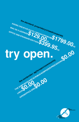
Something from the Open Colour Standard project that I feel is worth cross-posting here: my ever so lovely OCS properganda (not propaganda) poster. It sells Open Source graphics programs the easy way: by explaining how cheap they are compared to the proprietary stuff. Enjoy.

EDIT (12 May 2009): Here's a new version of the poster with better kerning. And I'm replacing the downloadable one on the OCS website with this newer, more correct version.

Labels: , , , , , , , ,

Thursday, March 12, 2009

RFID in Montreal

Here's some linkage to one of the things I've been busy with. The STM's OPUS card is unsafe and unsound (The Link)
And for your enjoyment, the ever so pretty picture I did to go with the article.

Labels: , , , , , , ,

Thursday, January 8, 2009

Print has problems

I'm catching up on my reading, going through a textbook about advertising and promotion, reading the bit about social networking sites as promotional tools. As is so often the case with textbooks, the information is out of date. Here's the problem: the book was published in 2008. Important news for textbook publishers: It's impossible to write about the internet in print. By the time the books gets to print and into the hands of readers, what was good, current information is out of date and outmoded. Print isn't fast enough.

What's the solution to this problem, then? A couple things. Thing one, I'd like to see my purchase of the textbook give me access to a pdf of the book as well. (A good example of a publisher doing this is The Pragmatic Bookshelf. Ubuntu Kung Fu, for example, offers a pdf option, as well as couple other neat things that I'm about to talk about.) Offering a pdf version means giving readers something searchable and easier to navigate than a physical book. That's important when the book in question isn't a novel. Thing two, I want to see online errata and updates. I know it's impossible to expect publishers and authors to constantly revise their books, but I'd really like a little community and challenge to build up around textbooks (for an example, look again at Ubuntu Kung Fu). Give me an errata section that users can contribute to, give me updates on the subject matter, give me a discussion board. In short, give me an online portal for the textbook. Make it relevant and timely. For marketing especially, things don't lie still. Timely subjects need timely textbooks, not a new version every couple years.

Labels: , , , , , , , , , ,

Thursday, November 27, 2008

A Manifesto Stub

Everyone needs access to information, not just those of us with good vision, full mobility, high level language skills and shiny new computers.

Labels: , , , , , , ,

Tuesday, November 11, 2008

Brain Training

People are just so darn interested in training their brains these days. We come up with all sorts of clever, synthetic ways to keep our brains in shape. We play brain training video games and live in houses that are meant to break the occupant out of normal behaviour. I think we do all that because we've stopped opening ourselves to the organic challenges that we should be encountering. Our lives are so boring and predictable that we feel the need to find ourselves fake challenges.

Labels: , , , , ,

Being profound isn't easy

When very few people knew how to read or write, it must have been much easier to write profound things. Today, with the huge mass of voices, all demanding to be heard and all distributed worldwide via the internet, it's far harder to write things that people will actually pay attention to and remember. We have such a huge volume of information, now. It makes it nearly impossible to actually process and give consideration to everything. And if I blog that sentiment? It's just another bunch of words in our huge wash of constant data.

Labels: , , , , , , ,

Friday, October 31, 2008

OCI logo revisited

The OCI logo I was so pleased with yesterday has been replaced by the OCI logo that I prefer today. Behold! Progress! Magenta progress, in fact.
I think this one looks far more dynamic.

Labels: , , , , , , , , , ,

Wednesday, October 29, 2008

The SPCC

There's a half funny, half serious idea I've been kicking around for the last few months. It's called the SPCC, or the Society for the Prevention of Cruelty to Creatives. The idea is twofold:

Part one of the SPCC is a helpline for bored and abused creatives. You're a designer who gets stuck cropping and resizing all day? Call and talk it over. Copy writer stuck with unreasonable deadlines and unresponsive superiors? Call the helpline and strategize. This half of the idea is quite similar to Designphone, an idea I blogged about last March. The main difference is that it would have a mandate beyond just serving designers and would instead be there for creatives of all types. It's part two that gets interesting.

Part two is basically a home for bored and misused creatives. Essentially, it's a retreat for creatives who just can't take it anymore. It would essentially be a sanctuary full of free time, other creative people, and the resources necessary to carry out personal projects. Creatives would be able to come down for a break from the monotony of doing boring, not terribly creative, creative work. It would also offer workshop retreats for open-minded management who would either like to reward their creatives with a break or learn how to be a little more creative themselves. Naturally, corporate rates would be rather different from the rates charged to individual creatives. Proceeds from corporate retreats would go to funding project scholarships for creatives with ennui.

The Society for the Prevention of Cruelty to Creatives: like that SPCA, only instead of saving animals, supporting commercial artists of all kinds.

Labels: , , , , , , , ,

Proper nouns on the Internet

While doing a little writing about traffic shaping and such things, it occurred to me that I don't know whether the name "Net Neutrality" actually qualifies as a proper noun. Many people treat it like a proper noun, capitalizing the first letter of each word, but there are also loads of people who don't. This inconsistency leaves me wondering whether it really should be a proper noun and some people are just being lax, or whether some people are just being overzealous with their capitalization. I've been hunting around to find out what exactly makes something a proper noun in English. According to the Wikipedia, a proper noun represents a unique entity. It then goes on to give examples like cities, the names of people, and specific physical things (like Bill of Rights, which may embody concepts, but has a physical manifestation all the same). But all of the things (not people, not cities, but things) mentioned are tangible. So, can movements and concepts be proper nouns? Net Neutrality isn't tangible. Is it allowed to be a proper noun? I'm thinking yes, given the capitalization of political ideologies and systems of thought. If Marxism and Liberal and Atheist can be proper nouns, surely so can Net Neutrality. I think, then, that I've answered my own question. Is Net Neutrality a proper noun? Yes.

Labels: , , , , , , ,

Saturday, October 25, 2008

A manifesto for ginger coons

[Having discussed the idea of mission statements for people, I set about figuring out what I need to remember when times get confusing. The result is the following point form manifesto. I'm posting it because I think several of the points are useful, not just for me, but for anyone else of a similar age and inclination.]
  • I will do things that interest me, come hell or high water
  • I understand that interesting things are sometimes accompanied by boring things. I will find joy in the boring things because they help with the progress of the interesting ones.
  • I must understand that degrees are only pieces of paper and that they may not make me happy or help me along with the things I want to do.
  • I will remember that there are twenty million (give or take) different ways to do the same thing.
  • I must remember to do things because they make me happy, not because I think I'm supposed to do them.
  • I will avoid sulking and stewing and hiding under the covers when I am unhappy. Instead, I will endeavour to take positive action.
  • I will not compare myself to other people. Everyone is different. That's the whole point. There's no reason to try to be the same as anyone else.
  • I will not seek easy answers from outside sources. They don't exist.
  • I must remember that most people do not achieve greatness before the age of twenty or even in their twenties. The people who do so are anomalies. I am not running behind schedule.
  • I measure my own success. People who try to measure my success for me are wasting their time and neglecting themselves.
  • The same goes for me: I have no right or time to measure the success of others. In short: I mustn't be judgemental.
  • I don't have to choose. I can do everything. I just can't do it all at once. I must learn to prioritize.
  • I will learn to excuse myself. I don't need to be right all the time. Changing my mind isn't the end of the world.
  • Grey areas are okay. Sometimes, "maybe" is a better answer than "yes" or "no."

Labels: , , , , , , , , ,

Thursday, October 23, 2008

Vegan trading cards

Finally, after years of being asked what vegans eat, I'm tired of answering. As a result, I've devised a clever solution: vegan trading cards. Imagine little trading cards which, instead of featuring hockey players, picture and explain vegan food. Each card would have a picture of a typical vegan dish on the front (think: curry, stir fry, hummus, tabouleh, etc.) and stats about that dish on the back. The stats would show ingredients as well as nutritional information. It would be a fun way to answer a question that does get a little wearing after a while. Not only that, but the nutritional information would prevent the second question that non-vegans normally ask, namely "Where do you get protein/iron from?" They could look at the card, see that vegans eat a variety of tasty food, and then be shocked by how nutritionally complete those foods actually are. It would save the valuable minutes of my life that I currently wind up spending, trying to remember what I've eaten for the last few days.

Labels: , , , , , , , ,

Wednesday, September 17, 2008

Another Kubla Khan

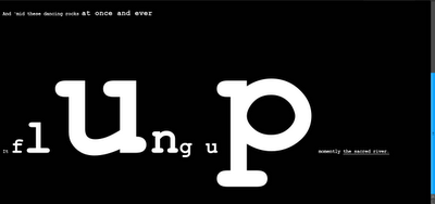
I'm kind of addicted to "Kubla Khan." It's a fantastic, profoundly strange and beautiful poem. It's also in the public domain, which lets me do nice things to it without infringing copyright. I've done an illustrated zine version in the past, I think I'm working on another. Just finished, though, is a very strange web based version.
It's kind of concrete poetry on the internet. Find it here.

Labels: , , , , , , , , , ,

Tuesday, September 16, 2008

The Internet is a Copying Machine

Below is my little lay-introduction to the Internet as the ultimate copy machine. It's altogether too easy to forget that this is an instrument built for copying.

Computers are copying machines. They do the job of duplicating even better than photocopiers. The Internet is the hyperactive child of computation in most respects, but especially when it comes to copying. Everything you so much as look at when browsing the Web (No, I'm not using “Internet” and “Web” interchangeably. Right now, I mean WWW.) gets copied onto your own personal hard drive. Let's say that again, shall we: Everything. That's the automatic aspect of copying on the Internet, as practised by our good friends Firefox and Opera (or their mean brother, IE).

Copying on the Internet isn't just automatic. There's also a social aspect to the copying. When you take digitized media, which is what populates the Internet, and put it in the same place as people, copying will inevitably happen. Say I put a photo on my website. You take a look a look at my website (That's what I want you to do, after all. Why else would I put it on a public website if I didn't want you to look at it?). First, your browser, which doesn't have much taste or discrimination, grabs everything my website has to offer and makes a little copy for itself. Then, quite independently, you decide that you like the photo. You like it so much that you download it. Maybe you use it as a background, or even print it out and hang it on your wall. It's perfectly natural. I make my photo available, you see and like. All you have to do to get your own copy is click your right mouse button (or CTRL click, if you happen to be a Mac person). It doesn't feel like work, and I still have my copy of the photo. In fact, my copy and your copy are exactly the same. And the copy that every browser makes for itself when someone looks at my website is exactly the same as our copies. (It doesn't feel like stealing, since you haven't taken anything from me. In fact, it isn't even copyright infringement, since you've only used it for personal study and can claim Fair Dealing. But you don't know that. You just liked the photo and wanted to look at it without coming back to my website every day.) In such a way, the Internet can be seen as a giant (mostly apolitical and amoral) copying machine.

Labels: , , , , , , , ,

Sunday, August 17, 2008

The week-old pizza flowchart

I humbly present to the reading few a handy tool for deciding whether or not to eat the pizza that's been sitting out for a week. I take no responsibility for any un-tastiness or food poisoning that might result from consulting this chart.

Labels: , , , , , , , , ,

Friday, August 8, 2008

An Easier Website

I was in a design meeting at work today. The complaint: Clients ask for "cleaner" or "more professional" websites. So, the boss muses out loud that we can't just adjust and make a website sixty percent cleaner. It struck me at that point that there should be a way.

Solution: Take a representative sample of people. Give them a word (professional, clean, edgy, etc.). Give them a pile of design elements (colours, layout pieces, whole layouts, typography, all that good stuff). Get them to rate each element on how much it matches their perception of the given word. Look for patterns in the responses. Sort by demographics, psychographics, industries. Take the data. make a website generator with a very simple interface: a white screen with a number of slider bars, where each bar represents a scale of zero to one hundred for a given trait (edgy, contemporary, clean, professional...). Any person who wants a website need only key in a little pertinent information about themself, and then move the sliders to get what they want. Press the button. Don't like the output? Move the sliders some more.

So, I'm sensing another thesis. Doctorate, maybe? The research should be fun and doable. It's just the actual programming that I'm a little scared of. But it could make a good collaboration with a computer science person.

If it actually worked, I'd put myself out of the web design business. On the upside, I'd secure my place in other circles.

Labels: , , , , , , , , , , ,

Saturday, May 10, 2008

More on video stores

First of all, I need to point out that Movieland is the only name for a video store. It's like calling a bowling alley Bowlerama. It's just the natural order of things.

So, I was in Movieland the other day (seriously) and I decided to carry out a little preliminary research for my video store study. I had a little chat with the guy at the counter. I asked if he'd ever had anyone in, renting movies and crying. His answer was encouraging. It turns out that there are criers. I am now unreasonably happy on two counts: people who cry in video stores do exist; people who work in video stores are suitably observant and would probably make excellent interview subjects.

The other cool thing I've noticed, in conducting my literature review, is that it's next to impossible to actually do a literature review for this project. I've found one study relating to the impact of mood on movie rental choice. That's as close as I can find to information relating to my topic. That's both good and bad. The good is that I won't be studying the same tired old thing. The bad is that secondary sources will be hard to find. Still, it's darn exciting stuff.

Labels: , , , , , ,

Tuesday, April 8, 2008

The Vernacular Woman

Finally finished a little site that I've been working on for a couple of months. Why did a small site take a couple months? Because I was trying to take a complicated idea that's also been done to death and make it new and simple. The result is a video with a little scene by scene didactic track down below. It's kind of like those audio picture books that little kids have.
Link

Labels: , , , , , ,

Sunday, April 6, 2008

Test all the children

When I was in school, every math teacher I ever had got treated to the frustration of trying to make me show my work. I never knew how I got to the answers, I just did. There was no process to grade on the test, no way to see if I was doing it the right way. Not showing my work was, of course, a Bad Habit. Now that I look back at it, I think that life might have been a little less frustrating for my teachers if they'd had a little background on the way I work and what sort of personality I have. Being an INFJ, I have the habit of intuiting, of not knowing why, but just knowing. That was my problem in math.

My thought, then, is that instead of waiting years for university career counsellors to do the testing, people should be tested on day one. I suppose that means having five year olds doing personality tests, although I'm sure there's a more humane way to do it. Every teacher knows that different people learn differently. Why don't they act on that? If we could sort out how children could best succeed, and if they could be taught in an appropriate way, school might become a lot less frustrating for everyone involved.

Labels: , , , , , ,