Tuesday, January 19, 2010

Colour for everything, especially wool

The post below is cross-posted on my Open Colour Standard process blog, but I thought it would be worth a look here, too.

There absolutely needs to be an open standard for print colour. I'm behind that and I'm working on it. But I'm increasingly of the opinion that there's more to it than print and screen. There's a world of physical things that depend on some sort of colour specification, whether loosely defined and changeable or rigid and consistent. On that first count, the loose and changeable, I've gotten to thinking about yarn and other animal proteins like silk and even human hair.

Anyone who knits knows well the pain of not buying quite enough yarn to finish a project, going back to the store, and finding that the yarn you've been working with, while still called by the same name, is a slightly different colour than before. Eventually, you learn to buy more yarn than you think you'll need, just for the sake of consistency. That's the problem with dye lots. Every batch of yarn, while using the same dye and same general process, comes out slightly different.

I'm not proposing to necessarily solve the dye lot problem. I have a hunch that a large part of it comes down to white and the inconsistency of the base colour of wool. But it has gotten me thinking. Wool is an interesting test case. It's easy enough to deal with, it has good possibilities for home brew colour experimentation and, most importantly, there's the dye. Wool, being an animal protein, can be coloured with acid dye. Or, to you and me, food colouring.

The food colouring angle is a good one. One of the biggest challenges of thinking about a spot colour system is sorting out the physical colour. It's been a hurdle in my exploration of colour for print. How, the thought goes, do you decide what the gamut of inks going into the spot colours will be? Are those colours consistent across ink manufacturers? And so on. This is the appeal of acid dye. In North America, at least, there's a handy gamut all ready to go. It's the set of dyes prefaced with the letters FD&C (food, drug and cosmetic) or D&C (drug and cosmetic). That's a limited gamut of dyes already carefully regulated by a government body. It takes away the gamut decision and just leaves questions of application and method guidelines/best practices, as well as the development of physical colours from those dyes and the translation of those colours into digital.

In short, expect some proof-of-concept wool and hair dye experiments from me in the near future.

Labels: , , , , , , , , ,

Saturday, January 9, 2010

Truth in design, Truth in production

There's a design principle that I've often taken for granted. Distilled down to one word, it's Truth, with a capital T. But what is Truth in design? How does it apply? What, in short, does it mean?

There are two examples I like to use when explaining Truth in design. They both have to do with materiality. Here goes. Say you're designing a poster. You want it to look a little old school, a little messy, but still a little official. In short, you want your typography to have the look of an old-timey typewriter font. An easy reaction, when pressed for time, is to grab a typewriter font. I'm not talking about Courier, but instead about something that tries to mimic the little errors and ink blots of a worn out typewriter. But that font isn't very true. Use it and you'll find that all the letters look the same, each instance of a letter exactly like its siblings. It's not organic. It lacks soul. Not only that, but it's obvious that it wasn't done with a real typewriter. Then there's the truthful way. You dig out the old typewriter and honest to goodness type out the text you want. Scan it, clean it, integrate it into the poster. Each letter is a little different and the whole thing comes by its blotches honestly. In short, it's true. It's meant to look like the product of a typewriter and it does because it is.

Truth, however, is also utilitarian. That's where my other example, the one with the corkboard, comes in. Say, for the sake of argument, that you want the look of pictures or notices pinned to a corkboard. Sure, you can open up your graphics program and plunk a stock texture of cork in. You can drag whatever you want onto it, even simulate the shadows cast by the tacks. But why would you? In real life, light casts shadows for you. If you actually print the photos (or notices, or whatever) and pin them to a real cork board, it looks right, automatically. Why add shadows when light can do it for you? If you try to do it digitally, you'll miss something, or agonize for far too long in order to not miss anything. Do it in reality and the details are taken care of. Nature does half the work for you.

In essence, Truth is about materiality and reality. It's about doing it properly, with the right materials. In an idealistic sense, it's about knowing that you've got something right, that it is how it should be and isn't just an imitation. In a practical sense, it's about covering your bases, not by thinking out every eventuality, but by letting reality do the work. It may not always be convenient, but it will always be right.

Labels: , , , , , ,

Sunday, November 29, 2009

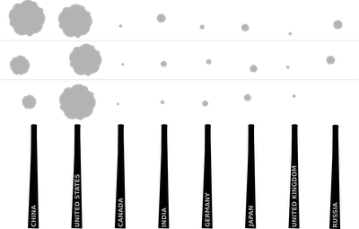
CO2 Emissions as smoke puffs

I know smoke stacks are a CO2 cliche, but they work so well. Below is a visualization of emissions from the top 8 worst offenders for the years (from bottom) 1990, 1997 and 2006.

Labels: , ,

Friday, August 21, 2009

Video games as accomplishment substitute

I have a hypothesis and an idea. Bear with me through a series of statements and questions.
The payoff of a task is in the hit of accomplishment gained from a job (well) done.
Video games (everything from freecell to The Sims) give artificial tasks that provide (largely)meaningless feelings of accomplishment.
Time and energy that could be used to accomplish tangible things in the real world are instead used to accomplish the goals set out as artificial tasks in video games.
The drive to accomplish is transferred from reality to video game.
Video games are a more convenient accomplishment engine because they give a series of small, easy to accomplish goals.
How do we use video games as substrates for real accomplishment?
Can the structure of small, easy goals be applied to real things that need to be done?
In short, can we use video games as engines to accomplish real life tasks?

Labels: , , , , ,

Friday, July 10, 2009

Didactic romance novels

Romance novels make up the largest portion of the American book market (source). They're incredibly popular, but no one can argue that they're great literature. They tend to be 150 pages of escapism and wishful thinking, not to mention the implausible plots. Nevertheless, a large group of women read an awful lot of these books.

Can we get women to improve themselves by reading romance novels? Is it possible to use the common elements of these books (international travel, sex, relationships, and so on) to expand the horizons of their readers? For example, can we use a story with a jet setting heroine to teach world geography? Could there be some slightly more in depth (and accurate) details about the creative careers so popular in the genre? Can we use the constant chatter about relationships to teach basic elements of psychological theory? In short, is there a way to sneak a little extra education and knowledge into the fluff of romance novels?

Labels: , , , , , ,

Wednesday, June 3, 2009

A troubled bridge over water

Here's a problem for which I don't yet have a solution. There's a wonderful canal in Montreal called the Lachine. About 20 years ago, Parks Canada took over its management, cleaned it up, built footbridges over it and built a park and bike path next to it. It has one particularly problematic footbridge. It's at the end of Atwater Ave., near Atwater Market. It's a very narrow bridge with little signs on each end telling cyclists to dismount before crossing. Of course, given its proximity to the market and several other attractions, it gets a lot of traffic. The traffic is mixed. There are pedestrians of all ages, cyclists and even tourists on the little electric scooters that can be rented at some of the shops along the canal.

What's the problem? The bridge is wide enough to accomodate two directions of pedestrian traffic. Even so, it gets cramped. The majority of cyclists, who are progressing at speed along the bike path, apparently want to get across the bridge and onto the next path as quickly as possible. All of this means that very few cyclists obey the sign and dismount. The cyclists speeding across the bridge pose a threat to pedestrians. Even worse, the renters of electric scooters don't dismount either. Their vehicles are heavier, faster and take up more space than those of the cyclists. So, because very few people obey the sign, the bridge becomes congested and dangerous.

I've thought up a few solutions to this, but none of them are sustainable. There's the citizen action approach. I could start personally mentioning to cyclists, whenever I happen to be crossing the bridge, that there is a sign telling them to dismount. But that doesn't work because I don't cross that bridge nearly enough to make a tangible difference. Then, there are institutional approaches. They could get bigger signs, although I really don't think that would work. They could install speed bumps, but that might not properly discourage all cyclists, might cause injury to some, and would inconvenience everyone.

Basically, I'm stumped. I can isolate the problem and even explain why it is actually a problem (and not just me being grumpy) but I can't figure out a good, sensible solution.

Labels: , , , , , , , ,

Wednesday, May 27, 2009

Tactile interfaces for digital making

I've got a problem. I've had a lifelong obsession with building things by hand. I love the sensation of seeing something come to life through my efforts. In physical making, there's a certain amount of feedback and consequence. I actually enjoy having to clean the ink out from under my fingernails after screen printing. These days, however, the majority of my work is digital, with very few protrusions into the physical world and with little to no non-digital making. That's gotten me thinking.

I'm planning my day. On my to-do list, I've put the words "update website." I know that I have a meeting later that I'll have to drag myself away from my work to attend. Here's the problem: when I'm only working digitally, it doesn't feel as if I'm actually pulling myself away from anything. The majority of my life, work and leisure time involves interfacing with a screen. Fixing my website doesn't feel like an engrossing task. There isn't a feeling of immersing myself in one thing, mainly because I'm not. I know that in the browser I have open to test my changes, I'll also have tabs going for email and Twitter. I also know that when I leave to go to my meeting, there won't be any tidying up to do. I'll just have to fold down the laptop and go.

It may seem absurd, but I want a way for my digital activities to be a little more demanding. I want to actually need to concentrate and prepare. I want the little rituals that come along with more physical forms of making. I mark things on a physical to-do list because stroking out an entry with a marker feels more satisfying than just clicking on a box. I keep a drawing board because some things are better sketched out by hand than drawn on a computer. How can I make my digital activities more tactile, beyond the standard idea of drawing with a tablet? Why can't I hook a block of clay up to a 3D modeling program and work with hands and knife? And, the big question: what's the tactile analogue of a natively digital activity like web design?

Labels: , , , , , ,

Thursday, March 12, 2009

RFID in Montreal

Here's some linkage to one of the things I've been busy with. The STM's OPUS card is unsafe and unsound (The Link)
And for your enjoyment, the ever so pretty picture I did to go with the article.

Labels: , , , , , , ,

Thursday, January 8, 2009

Print has problems

I'm catching up on my reading, going through a textbook about advertising and promotion, reading the bit about social networking sites as promotional tools. As is so often the case with textbooks, the information is out of date. Here's the problem: the book was published in 2008. Important news for textbook publishers: It's impossible to write about the internet in print. By the time the books gets to print and into the hands of readers, what was good, current information is out of date and outmoded. Print isn't fast enough.

What's the solution to this problem, then? A couple things. Thing one, I'd like to see my purchase of the textbook give me access to a pdf of the book as well. (A good example of a publisher doing this is The Pragmatic Bookshelf. Ubuntu Kung Fu, for example, offers a pdf option, as well as couple other neat things that I'm about to talk about.) Offering a pdf version means giving readers something searchable and easier to navigate than a physical book. That's important when the book in question isn't a novel. Thing two, I want to see online errata and updates. I know it's impossible to expect publishers and authors to constantly revise their books, but I'd really like a little community and challenge to build up around textbooks (for an example, look again at Ubuntu Kung Fu). Give me an errata section that users can contribute to, give me updates on the subject matter, give me a discussion board. In short, give me an online portal for the textbook. Make it relevant and timely. For marketing especially, things don't lie still. Timely subjects need timely textbooks, not a new version every couple years.

Labels: , , , , , , , , , ,

Wednesday, January 7, 2009

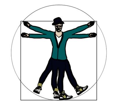
Vitruvian Hipster

Illustration to go with an article about -you guessed it!- hipsters. It was a fun concept, but I'm not terribly pleased with my execution.

Labels: , ,

Tuesday, January 6, 2009

The building blocks of life

Not DNA or anything else anyone ever calls one of the "building blocks of life." I'm talking about real, literal building blocks, the wooden ones that children use to make towers and forts and cities. Except that I'm talking about them in a figurative sense.

This morning, I've determined that life is a lot like a block tower. Here's how the theory goes: We are a building species. We build in both literal and figurative senses. We spend time building habitats, social networks, routines and reputations for ourselves. We are builders. But we're not building with concrete and rebar. We're building with (you guessed it!) blocks. Block towers can be sturdy or not, inventive or not. They can be anything imaginable. There are block towers that fall over if there's a breeze or someone shakes the table. No block tower can stand up to a determined kicking.

So, we spend our lives building block towers. In fact, our lives are block towers. Sometimes, if we really like the tower we've built, we spend ages admiring it. It's such a great block tower that we can't imagine any other. But then, if we're being pessimistic, the fear can set in. What if someone comes along and kicks the block tower down? If we add another few blocks, mightn't it ruin this beautiful tower? Best to leave it as is and hope nothing bad happens. To me, this is a problem. We're builders. Why should anyone spend a life trying to protect their existing block tower?

What's the best way to keep our block towers from getting kicked over? Tear them down before someone else does. We may think that we already have the best possible block tower, but maybe it can be better, or at least different. We need to learn to tear down our own towers. When we're not busy trying to protect the towers we've built, there's way more energy available to imagine and build better towers.

Labels: , , , ,

Tuesday, November 11, 2008

Brain Training

People are just so darn interested in training their brains these days. We come up with all sorts of clever, synthetic ways to keep our brains in shape. We play brain training video games and live in houses that are meant to break the occupant out of normal behaviour. I think we do all that because we've stopped opening ourselves to the organic challenges that we should be encountering. Our lives are so boring and predictable that we feel the need to find ourselves fake challenges.

Labels: , , , , ,

Wednesday, November 5, 2008

Subway Ceilings

I avoid looking people in the eye on the subway. In turn, they avoid looking me in the eye. When the subway is packed, there's nowhere to look but at the floor or ceiling. The problem is that I can only stare at the ceiling for so long before I get bored. I never think to bring a book and don't really like the tabloid newspapers they hand out at rush hour.

Solution: Commission art for subway car ceilings. Give commuters something interesting to stare at. Print a magic eye or Where's Waldo sort of graphic up there. Art, puzzles, poetry, whatever. Just no ads. I don't think that subway riders should be abused that way.

Labels: , , , , , , , , , , ,

Friday, October 31, 2008

On sensible careers

People try to be too damn reasonable and realistic about the future. I think those are silly and impossible things to be. Everything always changes. How can we expect to be reasonable about the unknown? I don't care if the world will always need engineers and lawyers and accountants. I don't want to be something the world will always needs. Where's the fun in that? I'd much rather be something new.

Labels: , , , , , ,

Thursday, October 30, 2008

Unbranded grocery stores

Assumptions: Food is a necessity. Without food, human beings can't live. Most people do not have easy access to farmer's markets or community shared agriculture schemes. Most North Americans shop in supermarkets.

Observations: It's impossible to look anywhere in a grocery store without seeing invasive brand messages. Okay, that last sentence was a tiny exaggeration. The ceiling is almost always free of brand messages and in most cases, so is the floor. The remainder, on the other hand, is generally quite thoroughly visually cluttered.

Solution: There needs to be a completely unbranded grocery store. I don't mean that there needs to be a store that sells only their own brand of food. I mean packaged goods in the unbranded store need to be blank except for the name of the food, the country of provenance, the nutritional information and the ingredients.

Think: Many of the necessary foods can already be found brand-free. Vegetables and fruits, more often than not, aren't branded (although there seems to be a trend towards branding them). Some stores have bulk sections which allow for the purchase of ingredients like flour that aren't branded.

Implementation: The unbranded grocery store needs to take advantage of the existing private label infrastructure. In the same way that Loblaw has food sold under its own name, the unbranded grocery store can implement a private label brand. The only difference is that this brand isn't a brand. It is instead the complete absence of a brand. Of course, it also makes a kind of good business sense to stock a store entirely with private label products. Margins are higher on private label than on national brands and prices can be lower.

Of course, the store would be a promotional disaster. Many consumers take comfort in familiar brands. A store that offered a reprieve from visual noise might not be widely welcomed, even if the prices were lower. But, just at this moment, having grown tired of too much visual clutter in supermarkets, I'd jump at the chance to shop at an unbranded grocery store.

Labels: , , , , , , , , , , ,

Saturday, October 25, 2008

A manifesto for ginger coons

[Having discussed the idea of mission statements for people, I set about figuring out what I need to remember when times get confusing. The result is the following point form manifesto. I'm posting it because I think several of the points are useful, not just for me, but for anyone else of a similar age and inclination.]
  • I will do things that interest me, come hell or high water
  • I understand that interesting things are sometimes accompanied by boring things. I will find joy in the boring things because they help with the progress of the interesting ones.
  • I must understand that degrees are only pieces of paper and that they may not make me happy or help me along with the things I want to do.
  • I will remember that there are twenty million (give or take) different ways to do the same thing.
  • I must remember to do things because they make me happy, not because I think I'm supposed to do them.
  • I will avoid sulking and stewing and hiding under the covers when I am unhappy. Instead, I will endeavour to take positive action.
  • I will not compare myself to other people. Everyone is different. That's the whole point. There's no reason to try to be the same as anyone else.
  • I will not seek easy answers from outside sources. They don't exist.
  • I must remember that most people do not achieve greatness before the age of twenty or even in their twenties. The people who do so are anomalies. I am not running behind schedule.
  • I measure my own success. People who try to measure my success for me are wasting their time and neglecting themselves.
  • The same goes for me: I have no right or time to measure the success of others. In short: I mustn't be judgemental.
  • I don't have to choose. I can do everything. I just can't do it all at once. I must learn to prioritize.
  • I will learn to excuse myself. I don't need to be right all the time. Changing my mind isn't the end of the world.
  • Grey areas are okay. Sometimes, "maybe" is a better answer than "yes" or "no."

Labels: , , , , , , , , ,

Friday, October 24, 2008

Ornamental humidifiers

Problem: My office is spectacularly dry in the winter. Dry air means dry skin and eyes. Dry skin means excessive use of hand cream. Dry eyes mean discomfort when staring at computer screens. Standard humidifiers are a hassle, and they look ugly, too.

Solution: To introduce more moisture into dry rooms, I've decided I need to build an ornamental humidifier. First, picture one of those little tranquility fountain things. You know, the tiny fountains that you plug into the wall and fill with water? So, take the fountain of your choice and introduce some heat into the works (I'm not quite sure how, yet, but maybe with some sort of well-shielded heating coil or something). Heat plus water equals vapour. Ta da! Something that looks less institutional and appliance-y than a humidifier but serves much the same purpose.

EDIT: Curses! It's been done already.

Labels: , , , , , ,

Wednesday, October 22, 2008

Hot -but not burnt- feet

Right now, I have a problem. I'm using the radiator under my desk as an ottoman. The radiator is on, heating my office. As a result, my feet are slightly too hot. That's the problem.

Solution? I need to build some kind of shelf over my radiator. Something just a couple inches higher than the radiator would eliminate the burnt feet problem. Plus, I could put some sort of cushy cover on it without burning down the house, which is an option I don't have for the radiator.

Labels: , , , , , ,

This is how we blog.

Having recently read an article about creativity (which is here, and thank you, Jasper, for pointing it out), I've realized that I'm losing a lot of ideas simply by not getting them down when I think of them. It happened to me again, just this morning, when I thought of something interesting but was busy writing something else. And now I've lost it. I can't for the life of me remember what it was I thought up. As a result, I've decided to attempt to blog every single damn idea I come up with from now on. "That's crazy talk!" you may say. And that's true. It is crazy talk. But I intend to try anyway. So, starting now, more posts, often shorter posts, less curation, more randomness. Oh yes.

Labels: , , , , , , , ,

Sunday, June 1, 2008

Some grown ups dream about credit cards

When I was younger than I am now, ten years ago, for example, when I was half the age I am now, I had more dreams. Everything in my life was going to be a big deal. I anticipated huge accomplishment, but I never seemed dissatisfied with what I had. I would invent perfectly spherical flying cars with nubbly little wings sticking out the sides and jets powering the whole works. Aerodynamics be damned, I thought that a spherical air car would be the most profoundly cool thing ever. I was an inventor and a fashion designer in my own mind. I discovered that Barbie dolls were insanely difficult to tailor for. I dreamed up a load of things that would hit the market years later. I was irate, just a few weeks ago when I saw a vending machine in a rest stop washroom selling toothbrushes with built in reservoirs for toothpaste. I've been told that when I was little, I'd speak French in my sleep. I barely even speak it awake anymore. My nightmares used to transport me to other dimensions, filled with human eating aliens. I'd save the world of a night. Now, even my good dreams involve things like credit cards and modems. In short, I'm worried that I've lost something. I've lost my capacity to have very big dreams. I've learned to be a little too realistic. I've lost my magical, optimistic dream world and replaced it with a life overly constrained by reality.

Labels: , , , ,

Thursday, May 22, 2008

This blog post may be recorded for quality assurance purposes

My phone company called this morning. That is to say, they called my cell phone at eight thirty in the morning. Let's remember, before I get on with the story, that they're supposed to have the best customer service of any mobile carrier in Canada. They enjoy mentioning that in their ads.

So: eight thirty, having breakfast, getting ready to start working, the phone starts buzzing on the table. I pick up and get the standard period of dead air. They make sure that I am who I'm supposed to be. Next is the ridiculous part. This call may be recorded for quality assurance purposes. They've called me, and they may or may not record the conversation. When I call customer service lines, I expect that. I may not agree, and I may not want my call recorded, but I accept that they've got a bargain going: I call for help, they may record my call. I choose whether or not to call their line for help. When I call them, I decide that I'm willing to have my call recorded in exchange for the help that I need/want.

Where's the bargain in the phone company calling me to ask about my phone bill and informing me that I may or may not be recorded? The only choice I've made is in answering the call. That's not what I think of as informed consent. And what would they do if I said "no" to them? Maybe I'll find out next time.

Labels: , , , ,

Monday, May 5, 2008

Bowls and forks

All I want in life right now are a bowl and fork that are meant to be together. I enjoy eating out of bowls, but it drives me crazy to not be able to move a fork properly around the edges of a bowl. If someone would make a fork that had the same contour on the side as the bowl it was meant to fit into, my life would be complete.

Labels: , , , , ,

Thursday, May 1, 2008

Autonomy for customer service representatives

A couple of weeks ago, I decided to terminate my mobile contract with Bell. I called Bell Mobility, in order to find out how much it would cost to break the contract. After being given the automation runaround, I got a fairly responsive human. The only problem was that she followed her script a little too closely. Even after a conversation about contract termination, even after I had explained that I was going to go to a different company, the Bell representative thanked me for choosing Bell Mobility. I was a little shocked at that. After a discussion explaining just why I'm not choosing Bell Mobility, she was required to thank me for choosing them. I asked about it. She told me that she didn't have a choice, she was required to thank me for choosing Bell. I think that in cases such as these, call centre employees should be afforded a little more autonomy.

Labels: , , , , , , ,

Sunday, April 27, 2008

On logos

At the moment, typography-heavy logos are popular. Many logos are solely typographical. That's fine. Some of the most famous and long-lasting logos are just logotype. Take IBM and ABC. Both are just treatments of letters. Both are well known in design circles. Both are instantly recognizable. There are loads of other examples of type-based logos. But I'd rather talk about a different kind of logo right now. That different kind of logo doesn't even need typography. A good example of this sort of logo is the NBC peacock. It communicates well and is well known. It works and is recognizable without the initials.

All is not well in logoland, though. At this point in time, many logos are quite similar to each other. They use basic fonts and are distinguished by the configuration and colour of words, as well as by small additional elements (example: the fast forward symbol on the Futureshop logo, the slant of the Zellers logo). Some logos are boxed, some have a coloured ground. Many logos don't say much about the company. This, in my opinion, is the result of the (sometimes) bland rules of good design being implemented in uninspired ways by bored (or boring) designers.

All of this, of course, does nothing to help me rationalize the logo I'm currently working on.

Labels: , , , ,

Thursday, April 24, 2008

Spectacularly bad faucet design

I managed to run across some really fantastically bad design today. I've found my new winner for the Least Usable Faucet Award. In the shopping concourse underneath a major Toronto office tower (BCE place, I think), I found a very difficult washroom. The problem with the whole thing was (is, considering that the faucets are most likely the same as they were this afternoon) that the sensors on the water saving, germ eliminating, effort reducing faucets were in the wrong place. If someone gives me a sink, I'm inclined to wash my hands at least partially in it. What the clever designers behind this particular washroom gave me did not really present that option. The idea seemed to be to position the sensor such that the hands of the user would be as close to the faucet as possible. If the hands of the user are positioned within the confines of the sink, the faucet doesn't go. To get the faucet to go, the user is forced to place her hands directly under the faucet. This results in hands pointing towards the edge of the sink. At the edge of the sink, there is, of course, a counter. This means that, due to the positioning of the sensor, water runs off the hands of the user and onto the counter. Result: wet counter. Not good faucet design, by any stretch of the imagination.

Labels: , , ,

Wednesday, April 23, 2008

Painters in the park, but never graphic designers

It seems that people like watching painters paint in parks. It stands to reason, since people often hold such events, that painters don't much mind painting in parks. They may even like it. Okay, so painters like painting in parks and people like watching them. This leads to all sorts of painting-in-parks events. Why not graphic-design-in-parks events, then? They're both visual things. They both turn out very visual, mostly flat things.

Today, I found out why there are no graphic-design-in-parks events. I took my laptop for a trip to the park today. The weather was nice and I wanted to sit under a tree. Big mistake. I now know why computer geeks like living in dark dungeons. The noonday sun turned my screen into a mirror. While it's great to see that I don't have any food stuck in my teeth, a reflective screen isn't exactly fantastic for doing picky work with colours and curves. I don't think we'll be seeing groups of designers mocking up newsletters or logos in parks any time soon.

Labels: , , , , , ,

Wednesday, April 16, 2008

An open letter to Facebook

Dear Facebook,

You have access to huge amounts of information about me. You know what city I grew up in, what activities I take part in, what parties I go to. You know what I study and when I'll graduate. You know what interests me and what causes I care about. You know how old I am, what my gender is, even my sexual preference and relationship status. You know where I live and who my friends are.

Why, if you have so very much information about me, do you insist on serving me ads that aren't relevant? You attempt to sell me foolproof scrapbooking supplies, on the assumption that I don't know thing one about design. You'd better tell the design school I've been attending for the past three years that you don't have confidence in their teaching. You'd show gay men ads for dating sites where they can meet great girls, wouldn't you?

Facebook, you have all the power and information in your hands. You have the technology. It's not a new idea. Why can't you serve relevant ads? You know what kind of music I listen to. Can't you give me pertinent ads from HMV or iTunes? You know what sports I like, and yet you refuse to advertise frisbees.

I cannot understand, no matter how hard I try, why a website that collects so much personal information is so bad at personalizing advertisements.

Labels: , , , , , , ,

Monday, April 14, 2008

Absentee parents in picture books

In discussing the classic picture book Are You My Mother? today, an important question was raised. Namely: Why is the bird not concerned about who his father is? The baby bird moves heaven and earth to find his mother, but is completely unconcerned by the absence of his father. Could this book be an early example of positive depictions of single parenting? Is the bird unconcerned because he sees his father solely as an earner and would rather seek nurturing from his mother? Who, the bird should be asking, brought in the worms while mother was warming the eggs? Constantly, the little bird asks, "Are you my mother?" Why does a book written long before the mainstreaming of single parenthood present a baby bird with no father in sight, and no concern for his absence?

NOTE: Don't take the above seriously. If it were meant to be serious, there would be footnotes.

Labels: , , , , ,

Sunday, April 13, 2008

The life ruiners

There are people who ruin your life by being terrible. They make everything collapse around your ears through malice or other negativities. Then there's the other kind of life ruiner. These people don't want to ruin your life at all. Sometimes, though, it feels like they have. They ruin your life through goodness. They ruin your life by being wonderful. Most of the time, you don't feel ruined. You feel better for having known them at all. It's only when you realize that no one else is as wonderful. That's when you see the good, the wonderful and the true as life ruiners.

Labels: , , , , , ,

Sunday, April 6, 2008

Test all the children

When I was in school, every math teacher I ever had got treated to the frustration of trying to make me show my work. I never knew how I got to the answers, I just did. There was no process to grade on the test, no way to see if I was doing it the right way. Not showing my work was, of course, a Bad Habit. Now that I look back at it, I think that life might have been a little less frustrating for my teachers if they'd had a little background on the way I work and what sort of personality I have. Being an INFJ, I have the habit of intuiting, of not knowing why, but just knowing. That was my problem in math.

My thought, then, is that instead of waiting years for university career counsellors to do the testing, people should be tested on day one. I suppose that means having five year olds doing personality tests, although I'm sure there's a more humane way to do it. Every teacher knows that different people learn differently. Why don't they act on that? If we could sort out how children could best succeed, and if they could be taught in an appropriate way, school might become a lot less frustrating for everyone involved.

Labels: , , , , , ,

Wednesday, March 26, 2008

A traffic shaping manifesto

Capitalism is supposed to be good because it provides consumers with choice and companies with an incentive to innovate. By traffic shaping commercial lines used by other ISPs, Bell is eliminating choice. I've tried Bell. I even used their internet for a year. At the start of that year, the delay in getting my internet running was truly impressive. During that year, my internet was spotty. I rebooted my modem more times than I can count. The support was bad and the service was expensive. Needless to say, I switched. I switched to an ISP I knew and liked. I switched to an ISP whose workings I know and who I can get help from without going through an automated system. I even had the BitTorrent discussion with my ISP. I found my new ISP to be both responsible and responsive. In other words, I switched to a small ISP, one of the ones Bell services. As a free market economy allows me to do, I made my choice.

That's why I'm feeling particularly irate. I have not contracted with Bell in order to get my internet. Traffic shaping their own customers is one thing. But I'm not their customer. I do not have a deal with Bell. Why, then, are they attempting to impose their policy on me? I didn't sign on for this. I am not a Bell DSL customer. I won't sit still and allow a party I have no contract with to decide what I may and may not do on the internet. I want to use BitTorrent in peace, for whatever legal purposes I may put it to (like downloading heavy files and perfectly legal movies like Good Copy Bad Copy). I don't want my bandwidth throttled because I'm using a protocol other than http. I do not want to be bumped because Bell feels the need to marginalize certain protocols.

This is why I say, to Bell, as a customer of an independent ISP:

You're not my ISP. Don't throttle me.


The above is in response to Bell Canada's new traffic shaping policy. Read more about it here.
I'm thinking of trying to go big with this. The groundswell is there and I'd like to see something a little more present than a facebook group. I've worked up the logo that I'm going to shove onto my website in protest, and now I just need to build a website/action to go with it.

Labels: , , , , , ,

Saturday, March 15, 2008

Online ads get more obnoxious and depressing every day.

Facebook just asked me if I wanted to not be lonely anymore. That is to say, more specifically, that an ad on facebook asked me if I wanted to not be lonely. Funny thing, I didn't even know I was lonely. Facebook clearly thinks I am, though. Lots of websites also think that I might like to know who my soul mate is. These ads clearly think that I'm not happy as I am. Maybe they think that only frustrated, angry, lonely, desperate people view social networking and news sites. And all of that is without even bringing my SPAM into the equation.

My SPAM thinks that I might like a status symbol watch. Or that I might like to look at wild girls. Or that I'm having troubles with an appendage I don't even have. It's offering me designer shoes for cheap, too.

If I were to judge our social climate by the quality of advertising I see, I'd get the idea that most people are pretty unhappy. I'd get the idea that people are lonely, that they suffer from un-fulfilling relationships and bad sex. And that they don't own enough expensive looking watches. I might think that social problems magically disappear when certain pills and supplements are taken, or at least that people want to think so.

I find that things look fairly bleak, when you judge by the ads.

Labels: , , , , , ,

Thursday, March 6, 2008

It isn't charity if you demand something in return

The grocery store I give some of my business to is doing a charity thing right now. They hit their customers up for money at the checkout, the money goes to disadvantaged kids or some such. Fine. I have no problem with that. The problem is that after you give them the money (the amount in this case is $2), they hand you a little slip of paper on which you're meant to write your name. Later on, they put all of the little papers up on the wall near the checkouts, so that everyone can see just how generous they've all been. That's the part I have trouble with. I have trouble with the idea that people demand recognition for their acts of charity. It's like the Livestrong bracelets that were so popular a couple of years ago. It's not enough to just give money for cancer research. People need others to know and acknowledge that they've given money. "Look at me! I'm terribly thoughtful, nice, and charitable." We're not giving for the sake of others. We're not giving to feel like we've done something good. We're giving so that other people will know how wonderful we are. That's my problem.

Labels: , , , ,

Wednesday, March 5, 2008

Good is defined by bad

So often, in real life and in all our media, you hear that no one feels like they're in a real romantic relationship until they've had a fight with their partner. It's not real until a hole has been poked in the good by the bad. Reality seems to necessitate negativity.

Labels: , ,

Thursday, February 28, 2008

Jam Jars

I have issues with jam jars. The standard practise is to get jam out of jars through the use of butter knives, or in some cases, a spoon. The jam jar is made of glass. The knife or spoon is made of metal. Jam jars come in all shapes and sizes, so do knives and spoons. All of this means that it proves very difficult to get the last of the jam out of the jar. It just doesn't work. I wind up getting frustrated and wasting valuable jam when I rinse the jar. A spatula would probably work quite well, since flexibility and malleability are of importance in this situation. The problem is, though, that I do not own a spatula small enough to fit into the jam jar. I know that they exist, but I don't own one. I can't see the use, other than for getting the last jam out of the jar. It seems a little wasteful to own a tool whose only use is to get the last jam out of the jar. Although who knows, that may be less wasteful than having to constantly waste jam.

Labels: , , , ,

The Language isn't built for it

Science fiction writers (I'm thinking Douglas Adams and Spider Robinson in particular) always say that our languages (particularly English) aren't built to deal with time travel. Fine. But at this point in time, we don't have that problem. We still travel at a rate of one second per second into the future. But there are other things that English has trouble with that we have gotten around to.

I'm thinking, in particular, of transgendered people. If I'm thinking about someone I haven't seen since high school, who was a girl then, but isn't now, what pronouns do I use. I know that if I saw him on the street, in the present, I'd call him by his new name and have no trouble thinking of him as male. But am I meant to change my memories? Can I treat his memory as something separate from his present? Can he have two different sets of pronouns that apply, one for the past and one for the present?

I think I may have lied in the first paragraph. This is a question of time travel. The time travel in question is my travel to my own past experience through memory. In this case, though, the past tense works just fine. It's the pronouns that are broken.

Labels: , , , ,

Not enough patience for tetris

I think I've reached a new low. I've discovered that I don't even have enough patience to play a tetris clone. When the blocks are falling, even with the down arrow held, I just want them to move faster. When they do move faster, I don't have the patience to carefully watch where they're going to land, which causes complicated pileups that I'd rather lose the game from than fix. That can't be right.

Labels: ,